In SMPL Q+A, we interview practitioners on all things relevant to branding, design and simplicity. Here, we speak with our colleagues about our rebranding partnership with Bristol Myers Squibb.
Today, Bristol Myers Squibb is a leading biopharma company, combining the agility of biotech with the reach and resources of an established pharmaceutical company. With a corporate brand dating back 30 years, the company needed a fresh start—a clear and compelling expression of its new vision of transforming patients’ lives through science.
Read the official statement from Chairman and CEO Giovanni Caforio here.
Why did Bristol Myers Squibb engage Siegel+Gale?
Bristol Myers Squibb was on the verge of a momentous deal—the acquisition of Celgene, a leading biotech firm. Their company Leadership believed that the integration of Celgene would create a new and better entity, so they decided to explore a new visual identity and brand voice. The new brand needed to signal a big leap forward and symbolize a new era for Bristol Myers Squibb as a diversified specialty biopharma leader.
To find the right brand partner, Bristol Myers Squibb engaged in a competitive pitch process with several leading branding firms—and ultimately selected Siegel+Gale.
What was unique about this engagement?
Grace Paik, Senior Strategist: Bristol Myers Squibb dates back more than 160 years. But while everyone has heard of it, the company has evolved a great deal since 1989, when Bristol-Myers acquired ER Squibb & Sons. Bristol Myers Squibb engaged our team to create a brand centered on a big idea that embodied everything the company does today—from embracing their commitment to compassionate science to developing and delivering innovative medicines that help patients prevail over serious diseases.
Strategy
What kind of shifts did the new brand need to make?
GP: The brand needed to make three significant shifts. One–refocusing the brand’s story, so that it was clear the patient is at the heart of everything Bristol Myers Squibb does. This helped reinforce the company’s mission and values. Two–elevating the experience of engaging with Bristol Myers Squibb as a whole, beyond individual product brands. The new visual and verbal identity really helps create cohesion across the brand. And, three –redefining the brand’s tone of voice by emphasizing humanity, making it feel much more personal.
Can you describe the new strategic platform?
GP: Early on, we learned that each employee puts the patient at the center of everything they do, whether they work in the lab or the mailroom. So the new platform blends the company’s legacy of pioneering science with its laser-sharp focus on patients, and it highlights the transformative impact Bristol Myers Squibb has on those patients’ lives.
What has the response been so far?
GP: The feedback has been overwhelmingly positive. Employees see the new brand as a bold transformation that celebrates a new Bristol Myers Squibb while staying true to the company’s vision. We’ve heard from a number of employees that the new visual identity system feels fresh, modern and distinctly different.
Design
It’s been more than three decades since Bristol Myers Squibb changed its visual identity. What was the concept behind the new design?
Rafael Medina: The new visual identity presented us with an opportunity to tell a new, more human story—one that represents the company’s commitment to patients. All the visual elements—logo, typography and color—work together to signal this and to position Bristol Myers Squibb as a forward-looking organization.
The previous logo represented 18 legacy lines of business that were a result of the merger between Bristol Myers and Squibb. The new symbol in the logo—a hand—represents the personal touch that employees, researchers and medical providers bring to their work. It’s a universal symbol of humanity, of healing and of giving and receiving care.
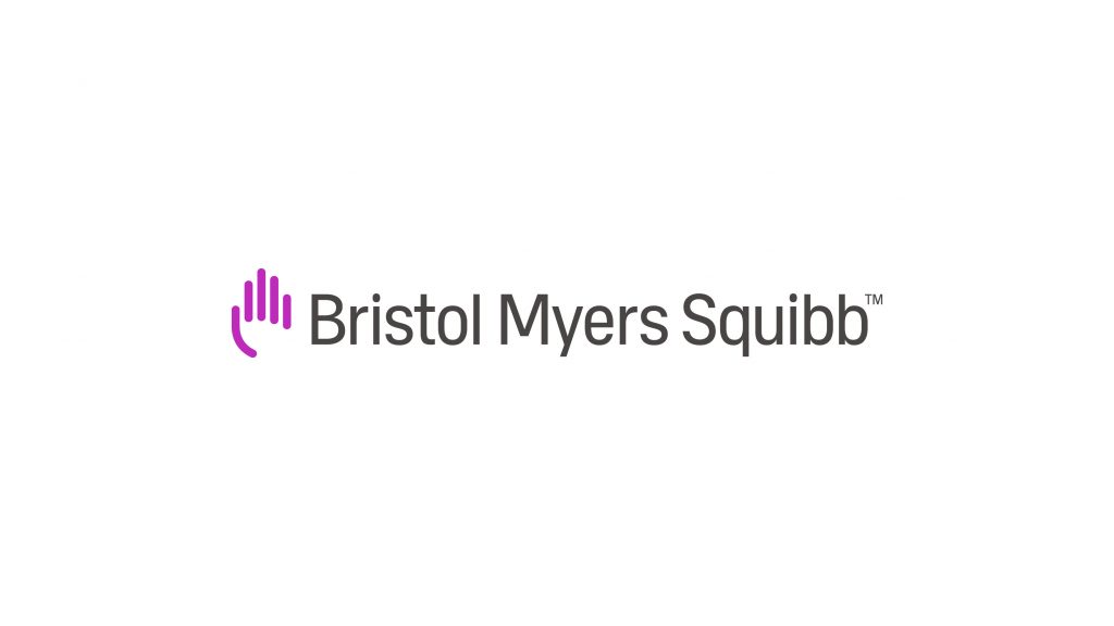
The elegant gray wordmark was drawn and exclusively customized for Bristol Myers Squibb. The condensed letterforms are rigorous and precise. Tall, strong and proud, the logo establishes Bristol Myers Squibb as a leader with real gravitas.
We chose a vibrant purple color because it stands out in the industry. It has personality, communicating a sense of warmth, brightness and passion.
Can you tell us a little about the development of the new typeface?
RM: The typography we created truly blends humanity and science. It has finely crafted, upright letterforms that pair with slightly rounded terminals to create an open, friendly feeling. It’s a robust font that works well in display, print and digital applications. When combined with the brand’s new voice, you can feel the human touch.
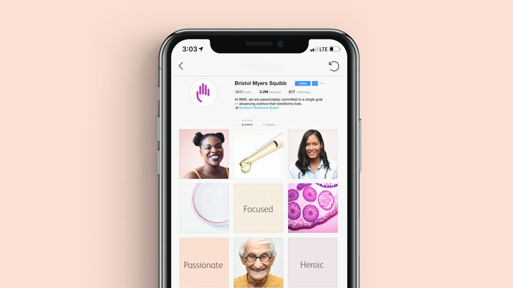
Traditionally, the healthcare and pharma sectors rely on the color blue. Why the move to softer pastels and neutrals?
RM: The brand’s new core colors are purple, gray and white. They’re a deliberate departure from the blues commonly used by many in the pharma sector.
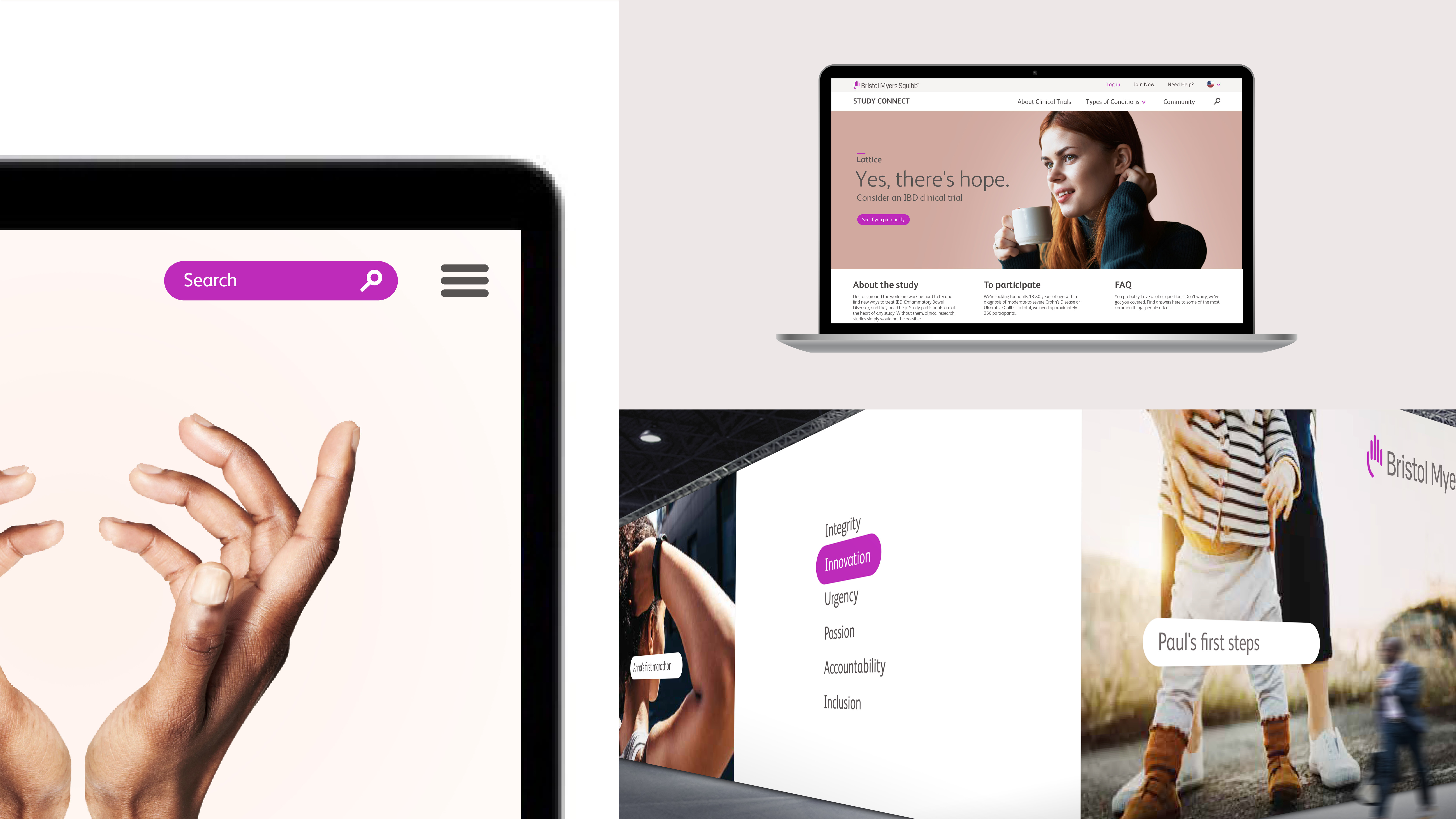
Purple acts as a purposeful accent to highlight a benefit from Bristol Myers Squibb, or to create a close connection between patients, people and science. It calls attention to key data and provides direction in digital applications through elements such as buttons and website navigation. Gray is sophisticated and functional. It’s used to create a sense of pacing and, simply, to deliver information. White is the clean, open space—the canvas for our ideas—and it makes Bristol Myers Squibb feel crisp and precise.
Our secondary palette complements the core palette with an ambient set of colors, designed to evoke feelings of comfort and security. This secondary palette consists of color washes that we refer to as “the color of humanity.” It’s meant to represent a diverse range of lives, stories and individual experiences. Therefore, we use this palette in backdrops to support portraits of people, along with other forms of content.

Brand Communication
What does the new narrative accomplish?
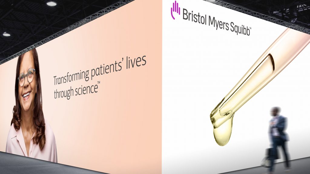
Billy Kingsland: In “Transforming patients’ lives through science,” Bristol Myers Squibb found not only a compelling statement of its vision, but a powerful anchor for a broader, more integrated story. One that celebrates the people who inspire breakthroughs, and the people who make them. The new Bristol Myers Squibb story truly embodies everyone and everything that goes into reimagining medicine and how it’s delivered to people everywhere, every day.
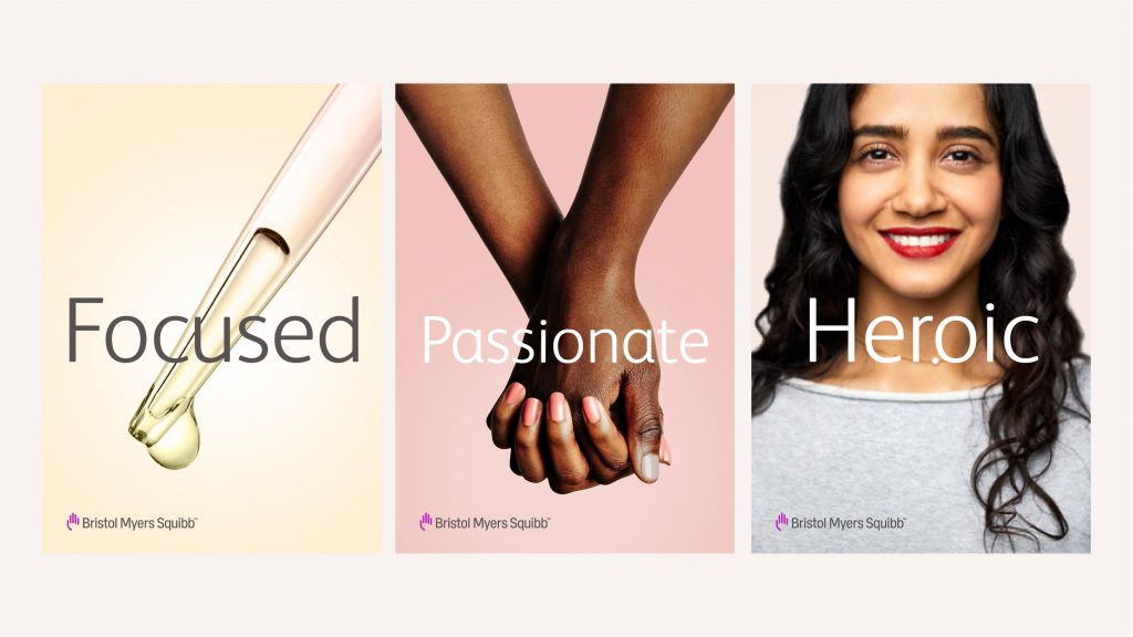
Tell us about the development of the new brand voice. How will we see it come to life?
BK: The new vision also served as our inspiration for the brand voice which is defined by the simple but powerful attributes—passionate, and focused. This is by design: we wanted the company’s employees to be able to grasp—and use—the voice easily. Tonally, these attributes help strike a balance between science and humanity—a balance that’s uniquely Bristol Myers Squibb. The voice will come to life across all communications. In fact, one of the first places we’ll see it is on the new, refreshed BMS.com.
