In SMPL Q+A, we interview practitioners on all things relevant to branding, design and simplicity. Here, we speak with our London-based Strategy and Design practitioners about our work with global owner and operator of floating production storage and offloading vessels BW Offshore.
Strategy
What made Siegel+Gale and BW Offshore such a good fit?
It’s a fascinating time for the company globally. Since its inception, their business was built on a very focused offering, Floating Production Storage and Offloading (FPSO) vessels for offshore oil production. And although that’s still a big part of what the brand does, there was a significant business case for pivoting into new areas. They realized the brand needed to expand and be able to adapt for an open future. We brought our deep expertise in both the energy sector and helping brands redefine themselves for a new era.
What was unique about this engagement?
We began working together in January 2020. There were already significant questions about the level of change, the scope of the assignment and relationships to other BW companies, including the newly formed BW Energy. Then the pandemic hit. An oil crisis upended the market. But on the flip side, the global energy transition accelerated. In a way, there was a need to show solid, stable operations but also an opportunity to move into new areas faster. The team needed to be flexible and open-minded. For example, the concept of floating wind production was initially a few years out. However, by the time the brand launched in Feb 2021, BW Offshore had acquired Ideol, their first renewable operations in market.
How did the strategy help the brand grow?
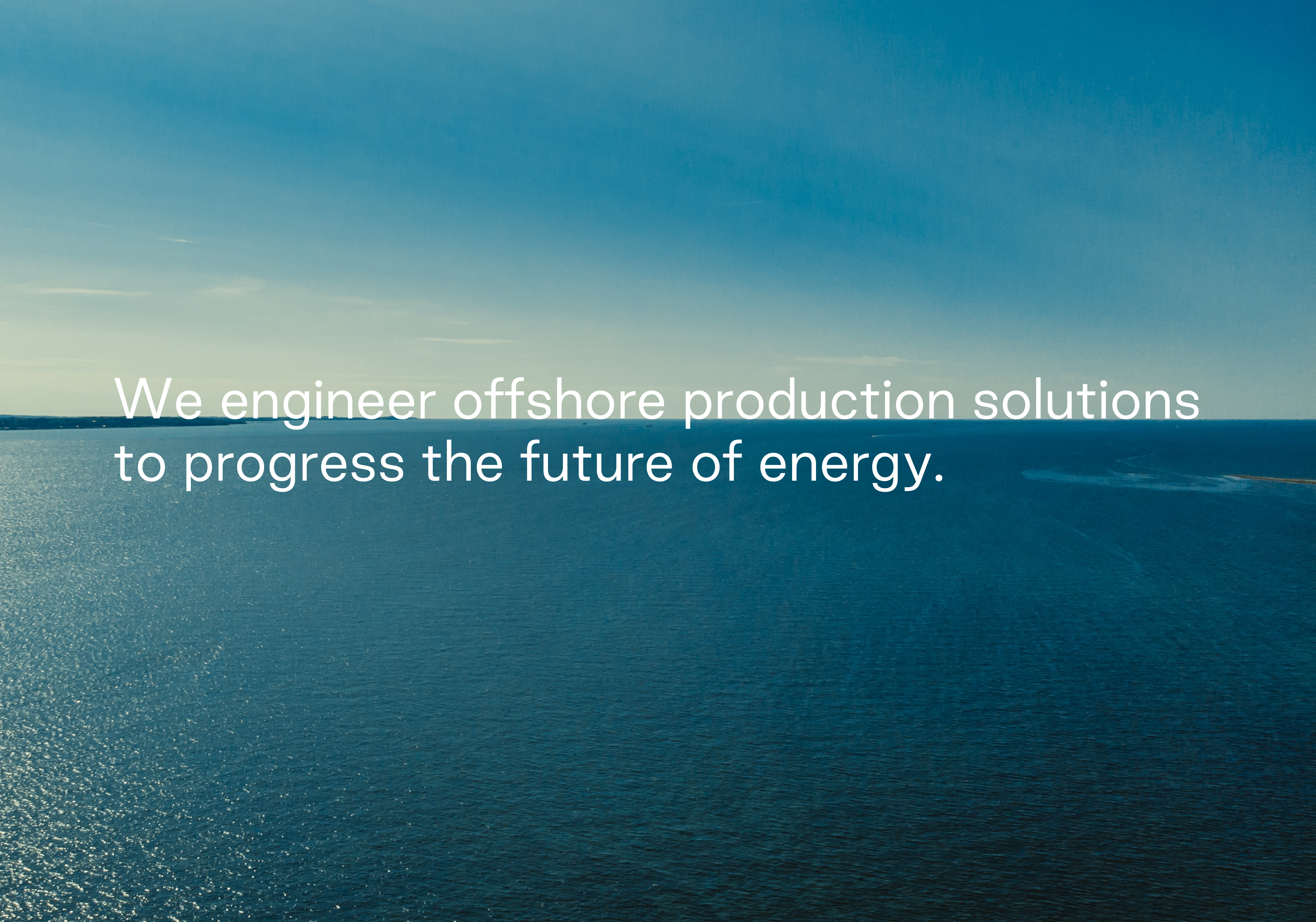
By mid-2020, it was decided the name would stay, but everything else was open. The first step was a new mission for the brand to explain where it was going. Rooted in the authentic truth as an organization with a core engineering mindset and matched with a bold ambition to shape the future, the statement reads, “We engineer offshore production solutions to progress the future of energy.” It clearly stated the businesses are willing to invest and innovate—leveraging expertise in offshore production. And it captures a compelling purpose that inspires customers, shareholders and employees. The brand is an active participant in global energy transition, and they’re proud to say so.
Design
What’s the inspiration behind the identity?
Carly Dunne: Sometimes, evolving the brand can be a bigger challenge than changing it altogether. Connecting to the strategy, the visual metaphor of the horizon line on the open sea became a fresh new approach for the brand identity.
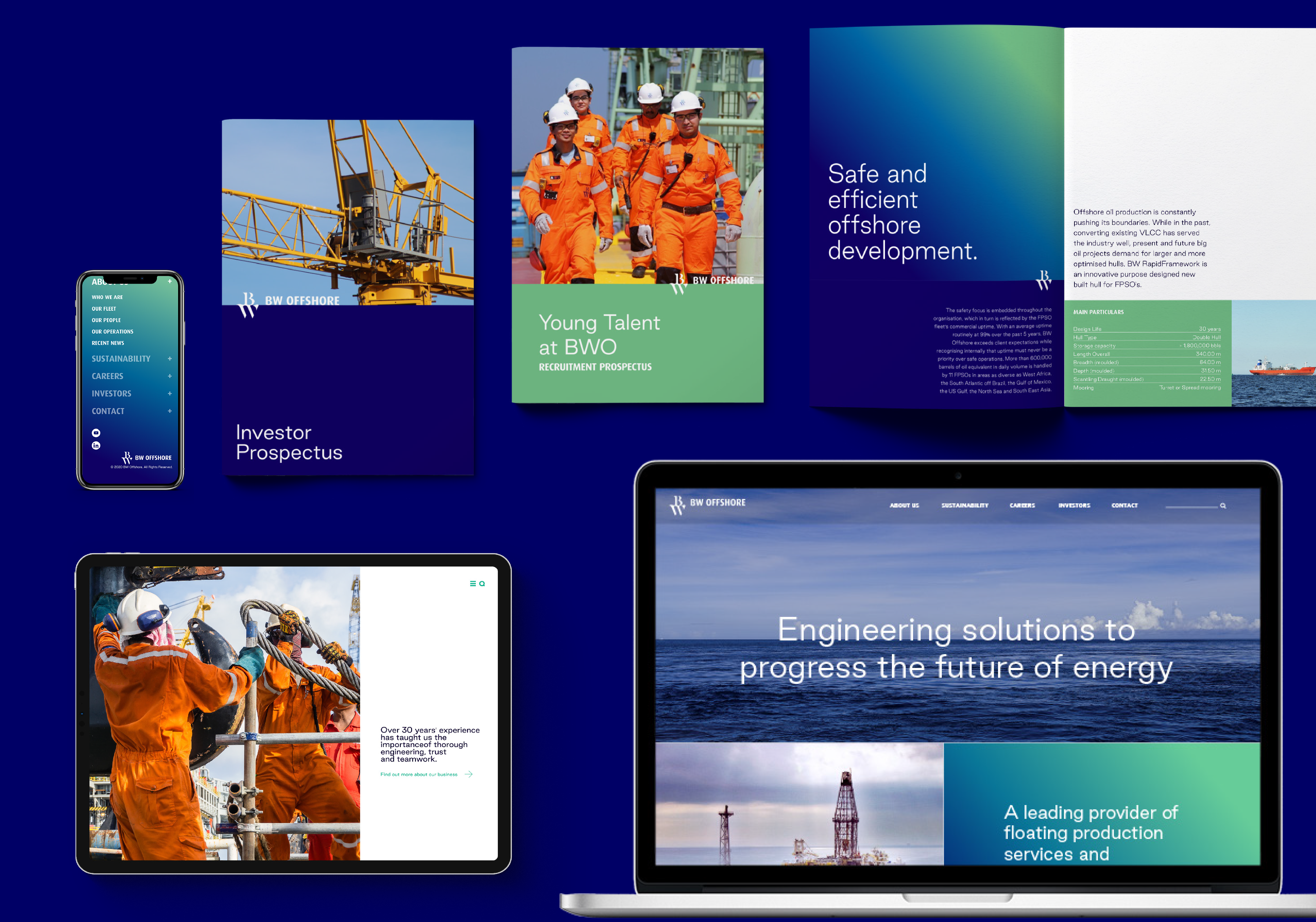
It was vital for us and BW Offshore to continue the visual legacy while evolving our design approach to refresh what it already had to offer. The idea behind the horizon played a vital role in creating new and innovative creative assets to grow the brand. We introduced a modern gradient, combining colors from their existing palette, especially their bergsen green–a color that has been with the business since its founding–with new variant tones. This meant we could create something that looked fresh and enticing, ensuring the brand stands out while maintaining the visual identity.
Imagery was essential for us when designing the new website, and we wanted to make sure that all the assets used were of BWO’s people and vessels. It was important to us not to rely on stock imagery and to truly represent the heart of the business. We used imagery of horizons to emphasize the brand’s idea that the horizon is the most consistent part of the ocean while representing BW’s principles of being smart, solid, brave and adaptable.
We redrew the existing logo so that when combined with the horizon imagery, everything worked aesthetically. Discovering the right typefaces for the project was necessary. As the brand already had its own widely used Dax font, we aimed to find something that complimented the typeface and modernized the brand. By choosing Good Sans, a modern, minimal san-serif typeface–we were able to create a new and inspiring pairing that complimented each other across various mediums.
