Birchbox
Oh, make me over
A fresh face for a beauty disruptor
Challenge
Launched in 2010, Birchbox redefined the beauty category with its fresh, hassle-free subscription boxes. But as competition became more fierce, the company needed to reach beyond its loyal customer—the young beauty enthusiast—to stay on top.
Insight
We discovered that most women—a staggering 80%—see beauty as a useful part of their lives, rather than something that’s core to their sense of self. This “Beauty Majority” was looking for a home where perfection wasn’t idolized, and beauty was fun.
Answer
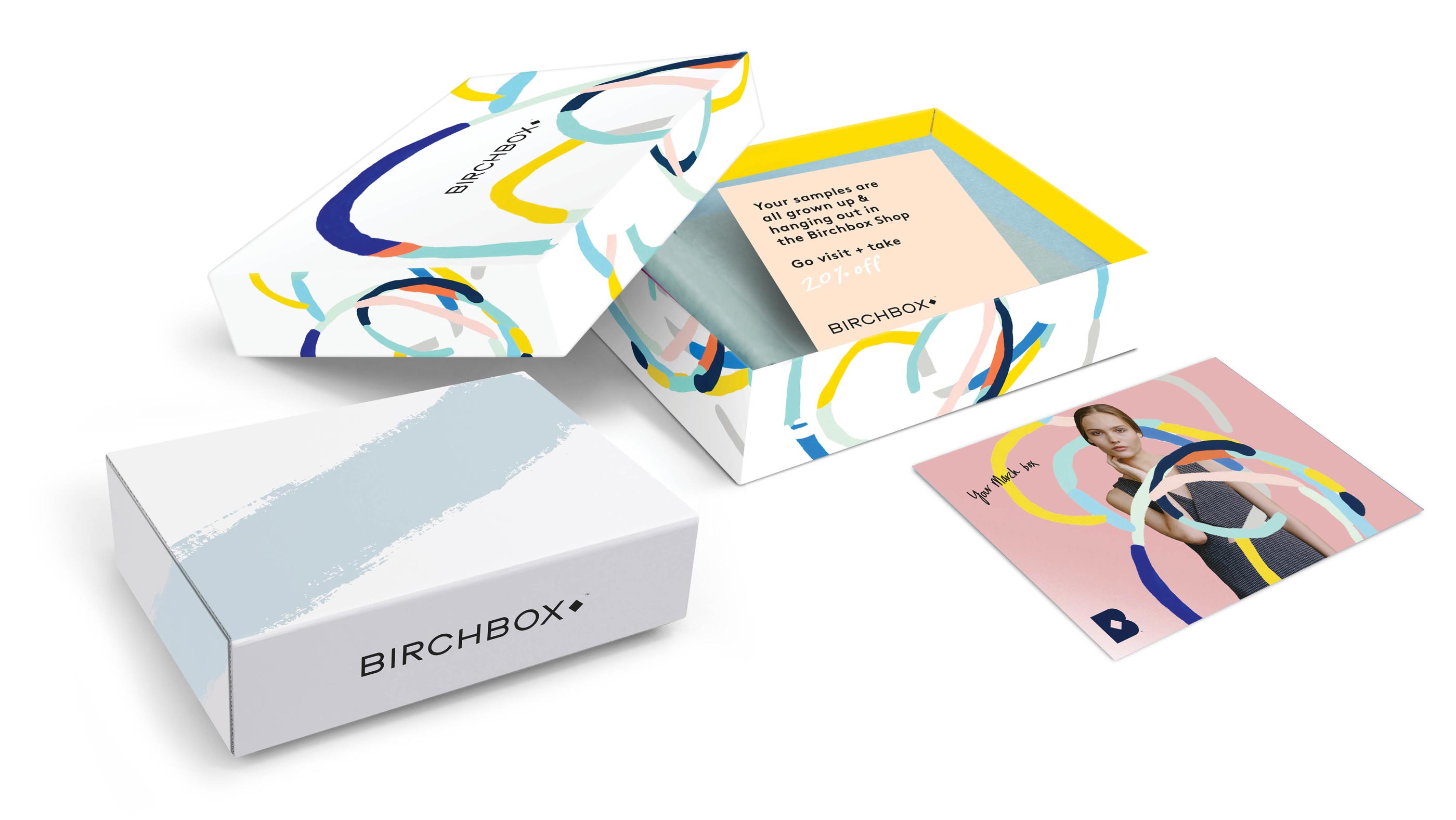
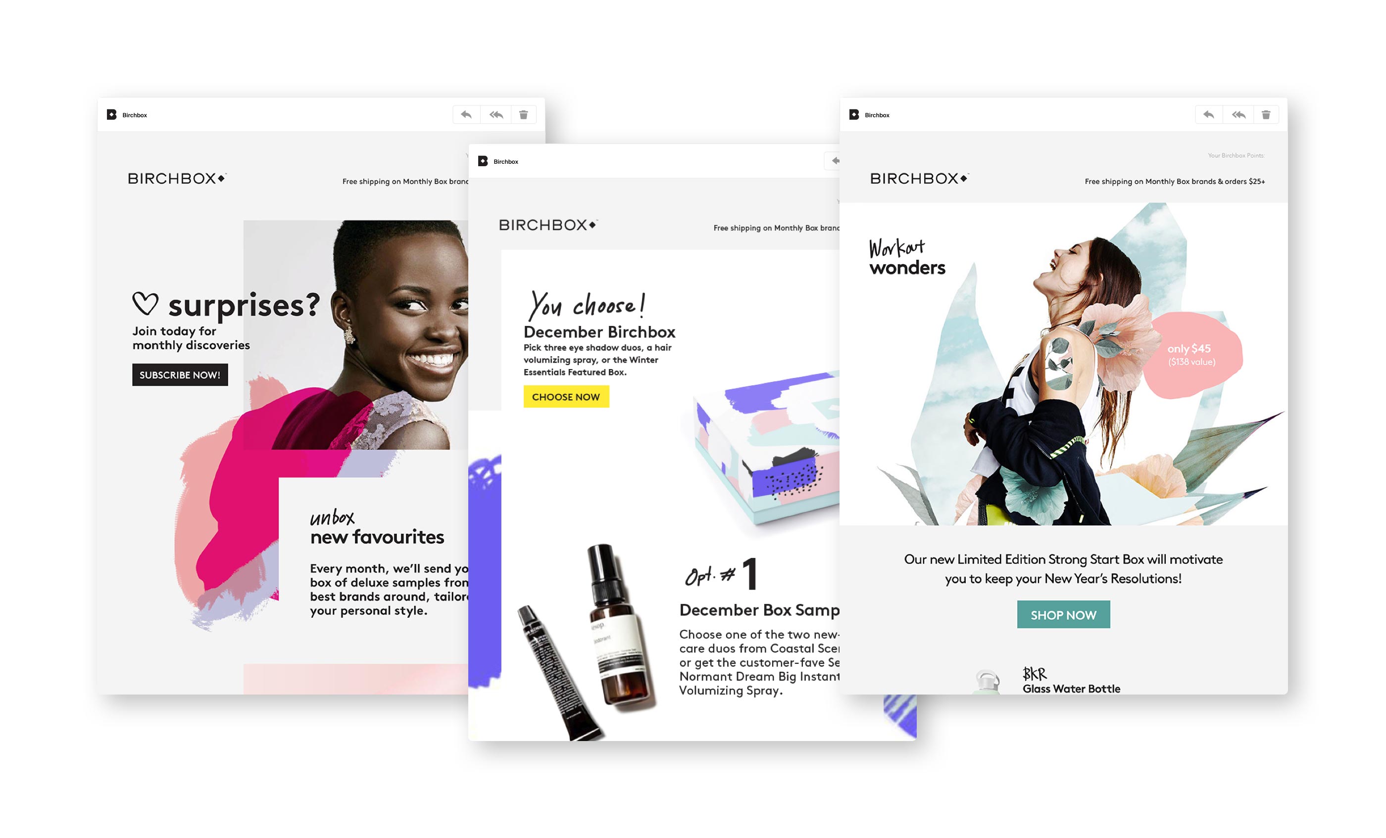
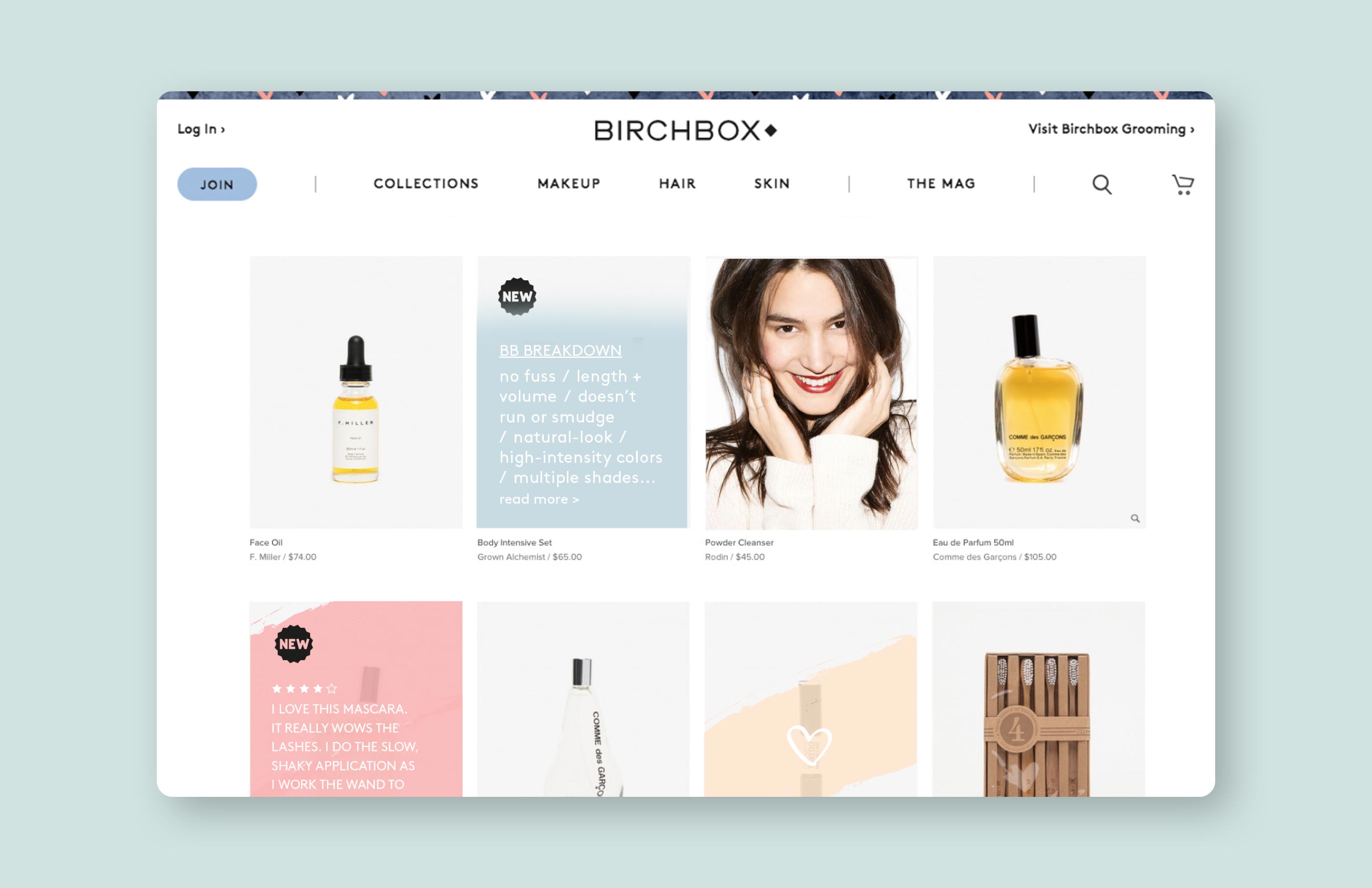
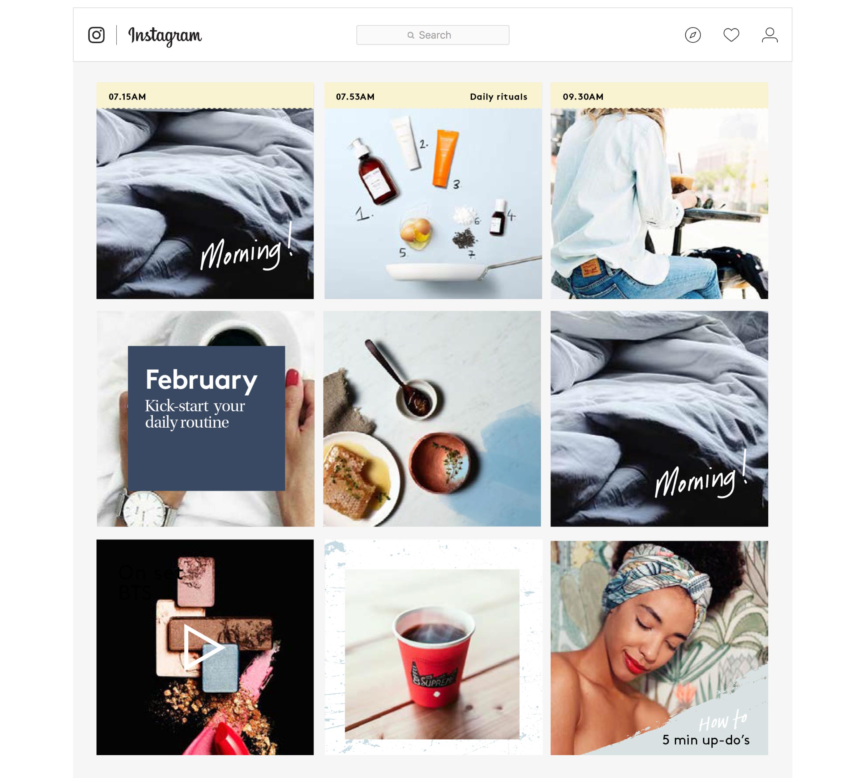
To create a feeling of “imperfect polish,” we introduced the voice of the “best friend beauty editor”—based on the founders’ real-life acquaintance—and guided the brand’s content creators in evoking her knowledgeable, lively and down-to-earth tone. In our design, we played with patterns and graphic elements reminiscent of photo outtakes and playful doodles. The result: a visual identity offering an approachable alternative to impersonal mainstream cosmetics.


Results

HOW: Promotion and Marketing Design Awards—Merit, Visual Identity Redesign
W3 Awards—Silver, Brand Strategy
