In SMPL Q+A, we interview practitioners on all things relevant to branding, design, and simplicity. Here, we explore our rebranding work for FileMaker. The technology company engaged Siegel+Gale to create a modern brand that accurately reflects the business offerings, values and vision of the business. Read the official announcement from Claris here.
Account Management
What was the original brief from the FileMaker team?
The brief started as an assignment to refine and clarify “Workplace Innovation Platform” as a foundation for the new brand. We were tasked with transforming the current FileMaker brand into something that accurately represents its business offerings, customers and values.
Why is this investment in brand such an important milestone for the company?
Your brand communicates who you are, what you stand for and why you exist. As FileMaker acknowledges its rich history and continues to look towards the future, it is essential that the brand signals the start of a new chapter.
There were several catalysts for our engagement—the primary being the strategic acquisition to expand its product portfolio. FileMaker was planning to announce the acquisition of Stamplay, a workflow automation service. This new offering led FileMaker to reevaluate its brand positioning and identity.
“The team at Siegel+Gale took on this project with as much enthusiasm and clarity as our team brings to our platform and mission. It was a fantastic partnership and the resulting brand identity is perfectly in line with our vision for the company.”
–Ann Monroe, (Former) VP of Worldwide Marketing & Customer Success, Claris
For more about the rebrand, read Brad Freitag’s blog, Introducing Claris International Inc.
Business Analytics + Insights
Why was research an essential part of this partnership?
We found that FileMaker had a large number of long-term users and loyal customers who utilize the platform. We employed research as a means to better understand current brand perceptions within the developer community and identify attributes that are important to them. Partnership and trust were central to the team, so including these groups as part of the process was essential to our brand development.
What research was conducted as a part of this rebrand and in what topic areas?
We fielded a brand-equity study to learn what is authentic to the brand and what resonates with audiences. The study revealed brand awareness, brand strengths, perception drivers, and priorities for key customers, allowing us to understand the audience landscape and uncover additional opportunities for the brand.
Strategy
Can you explain the new brand positioning as a workplace innovation platform?
Jenna Isken: Everyone we talked to—employees, partners, customers—wanted to discuss the solutions that FileMaker enabled. It became clear that while the product was the means, the purpose of the company was about the potential that could be achieved with it. “Power to the Problem Solvers” embodies the commitment to empower all people—regardless of ability or background—to create their solutions, solve their problems, and achieve their success.
Design
What was the concept behind the visual identity refresh? Any details you would like to call out?
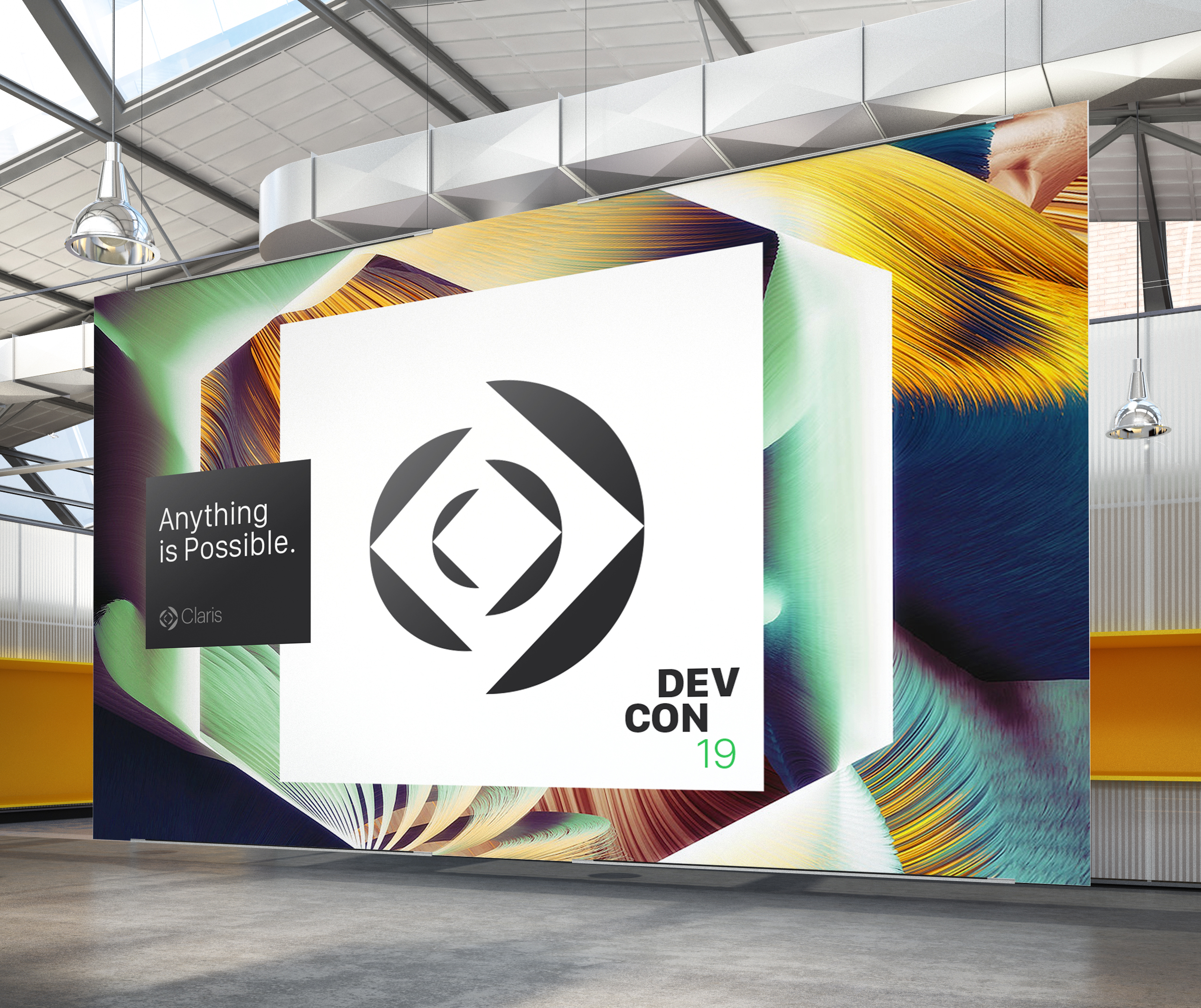
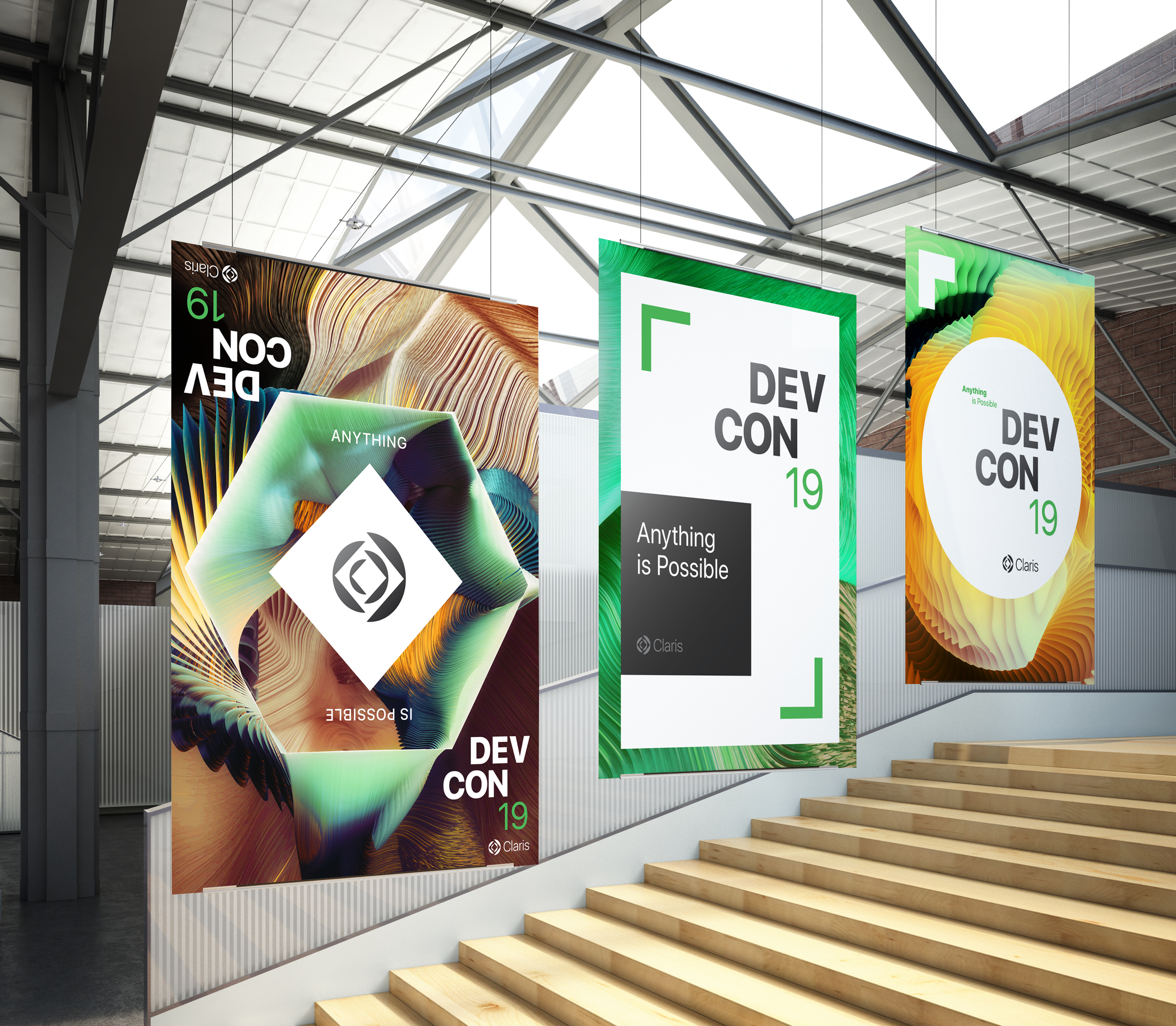
Matthias Mencke: Round and angular forms are combined within the symbol to express a human and approachable personality while also evoking focus and precision. The arrangement of shapes suggests growth from a central point. The open space in the center of the symbol speaks to the idea of starting with a clean slate.
The composition of the shapes creates an interplay of positive and negative space, which serves as a visual metaphor for innovation and for applying one’s ingenuity to solve problems surprisingly and unexpectedly. From the combination of positive and negative space, arrows emerge to suggest forward movement and agility.
The logo complements the Claris name and speaks to the idea of shining a light on what users are capable of achieving with the Claris workplace innovation platform. It is supported through a robust visual system that includes graphical elements, colors, photography, typography, and computer-generated artwork.
Computer-generated art supplements photography as key visuals representing limitless creative possibilities of the Claris platform. The artwork blends fluid forms with angular geometry to create dynamic and layered compositions, extending the visual language of the symbol to the design system.
Are there any specific iterations you’d like to call out in terms of how the brand’s visual identity evolved during the engagement? Any concepts you liked, but were set aside for one reason or another?
MM: We developed a range of visual identity concepts to express the new strategy for the brand. The exploration enabled us to identify creative territories that resonated with the Claris team.
As we were refining the chosen design concept, it was necessary to underscore the unique value that Claris brings to the world, visually expressing the platform’s unique features and benefits.
We refined the arrangement of shapes in the symbol to suggest layering and assembling components into a cohesive whole, echoing how the Claris platform is a flexible tool that allows users to assemble and orchestrate modules to create a customized app.
The visual relationship of the nested shapes intentionally captures how the Claris platform facilitates seamless integration of various components and data sources. Additionally, the deliberate composition of elements facing each other speaks to creating resilient connections and enabling collaboration.
Brand Communication
How do the audience-based messages connect to the broader brand strategy?
Our audience-specific messaging helps developers, partners, and employees experience that strategy through their own unique lenses. By starting with an understanding of who we’re speaking to, we can craft communications that connect on a personal level, while reinforcing a clear, consistent brand story across audiences.
How was the brand voice selected?
The Claris voice is rooted in the brand’s values and designed to offer communication teams a simple way of crafting copy that ultimately brings “Power to the Problem Solvers” to life.
Naming
Is it common for companies to revert to their original names? What are the benefits of reverting to their original name?
Our research uncovered that very few people were familiar with Claris, so there was a huge opportunity to build a professional brand for a global audience. It’s a great name on many levels—a two-syllable, easy-to-pronounce, Latin-based word that speaks to clarity and simplicity. The executive team rallied around the potential to breathe new life into the Claris name.