In SMPL Q+A, we interview practitioners on all things relevant to branding, design, and simplicity. Here, we speak with our practitioners about our rebranding work for Hudson.
Hudson engaged our firm to tell the story of its remarkable evolution—from a few newsstands in LaGuardia Airport to anchoring more than 1,000 stores in over 80 airports and transit hubs across North America. The refreshed brand reflects Hudson’s diversity, established relationship with travelers and focus on the future. Read the official announcement from Hudson here.
Why did Hudson engage Siegel+Gale?
Heather DiLeo: Hudson’s legacy brand was instantly recognizable as a landmark associated with travel essentials and books. However, over its 30+ years, Hudson had evolved from a few newsstands in LaGuardia Airport to anchoring more than 1,000 stores in over 80 airports and transit hubs across North America and beyond by providing not only retail and convenience but specialty retail (including tech and luxury brands), duty free, and food and beverage destinations. In order to own its role as a leader in shaping travelers’ experience across North America, it was time to refresh the brand to reflect its diversity, established relationship with travelers and focus on the future.
HDL: Hudson embraced customer sentiment as its North Star and looked to build its new brand around being the Traveler’s Best Friend. With that in mind, we used research to validate its reputation and suggest new approaches that would enhance its singular role in airport travelers’ experience. Building on our strategy, we worked first on developing a brand voice that would allow Hudson to respond authentically to travelers, in a way that captured the ethos of its culture and team. Our visual identity grew out of the new brand voice.
“Airports are much more than where flights begin and end. We aspire to create new solutions, roll up our sleeves and get to work, empowering every member of our team to exceed travelers’ expectations. I’ve been with the company since the beginning, and I’m proud to have been part of Hudson’s journey, which has provided us with new worlds of opportunity to explore.”
—Roger Fordyce, Chief Executive Officer & President, Hudson
Business Analytics + Insights
What did research uncover to help inform the direction of the rebrand?
Marc Desmond: In order to ensure the new brand would resonate with key audiences, we conducted qualitative interviews with airport directors and a quantitative survey with airport travelers. From our conversations with airport directors we learned that although Hudson was a highly respected brand with a great reputation in the industry, there were areas of opportunity that would set it further apart from competitors. In particular, Hudson could do more to demonstrate its strengths in bringing innovative, fresh ideas to enhance the airport terminal experience and showcase its deep understanding of the traveler. Our findings informed how the brand could be fresh and modern while retaining its powerful reputation.
With our survey, we were able to measure travelers’ satisfaction with each terminal touchpoint (gate seating, food options, news stores, etc.), and to quantify each touchpoint’s impact on driving satisfaction with the terminal overall. This allowed us to prioritize which touchpoints Hudson should focus the most attention on in the future to solve airport travelers’ most pressing needs while elevating terminals’ cachet for airport directors and vendors. It also served as a proofpoint that substantiated Hudson’s knowledge of the traveler, which we knew airport directors were seeking in a retail partner. We know this space well, given our work for clients like IATA, the trade association for world’s airlines.

Design
Can you describe the process behind developing the new visual identity?
Fernanda Canellas: We started the engagement with Hudson by working first on their brand voice and the way they communicate with their audiences, which gave the design process a great foundation to build upon. We held a brand workshop to assess how their current visual identity behaved and how they wanted it to look and feel in the future. Working closely with Hudson’s internal team offered the design team lots of insights which informed the entire process so that we could ultimately deliver a visual identity that spoke to their promise and purpose: “Together we turn the world of travel into a world of opportunity by being the traveler’s best friend.”
What was the concept behind the new identity? Any inspiration you would like to call out?
FC: We wanted the new identity to capture the vibrancy and enthusiasm Hudson has as a company—Hudson employees are treated like family, and are genuinely thrilled to be part of the organization.
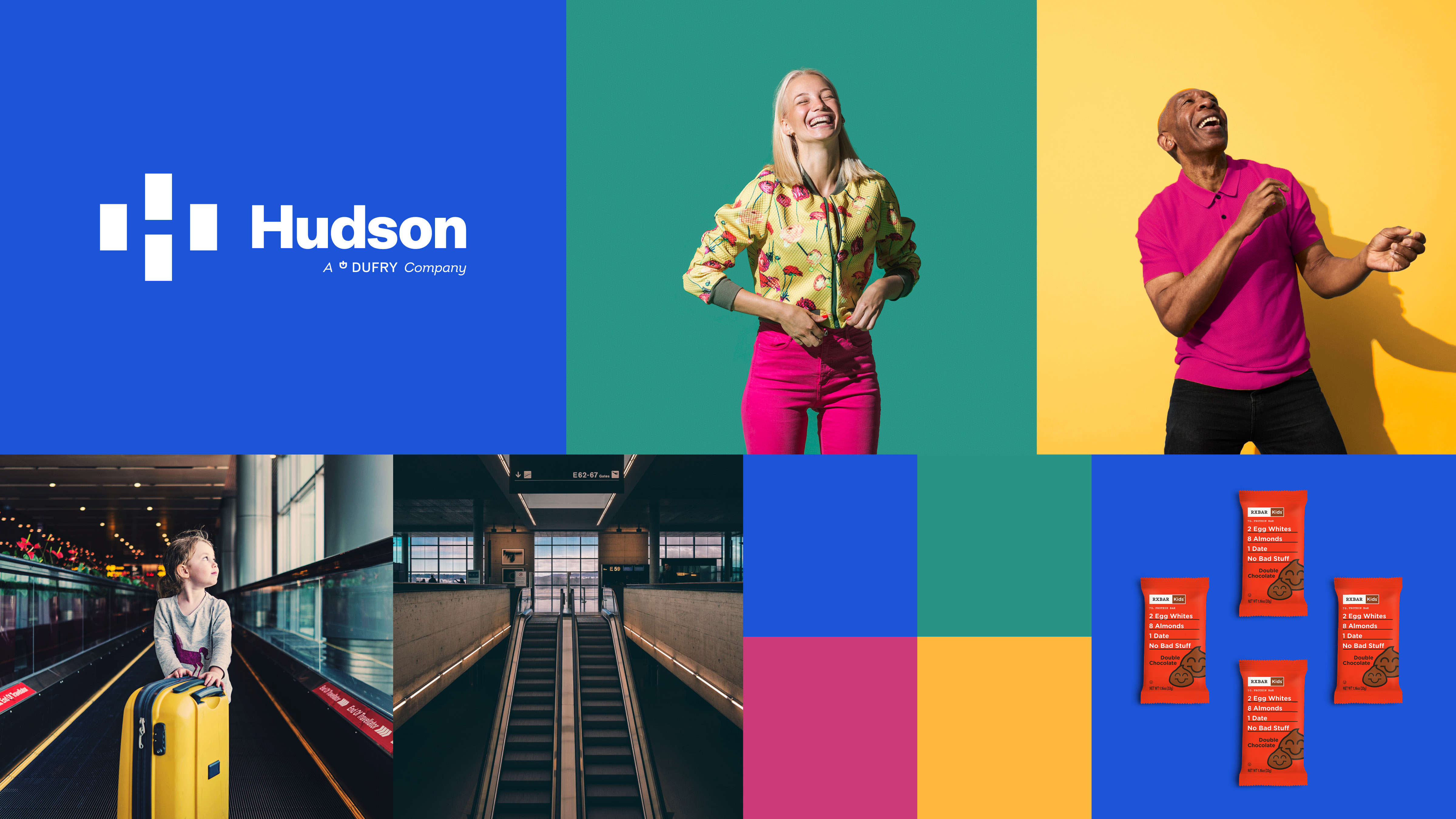
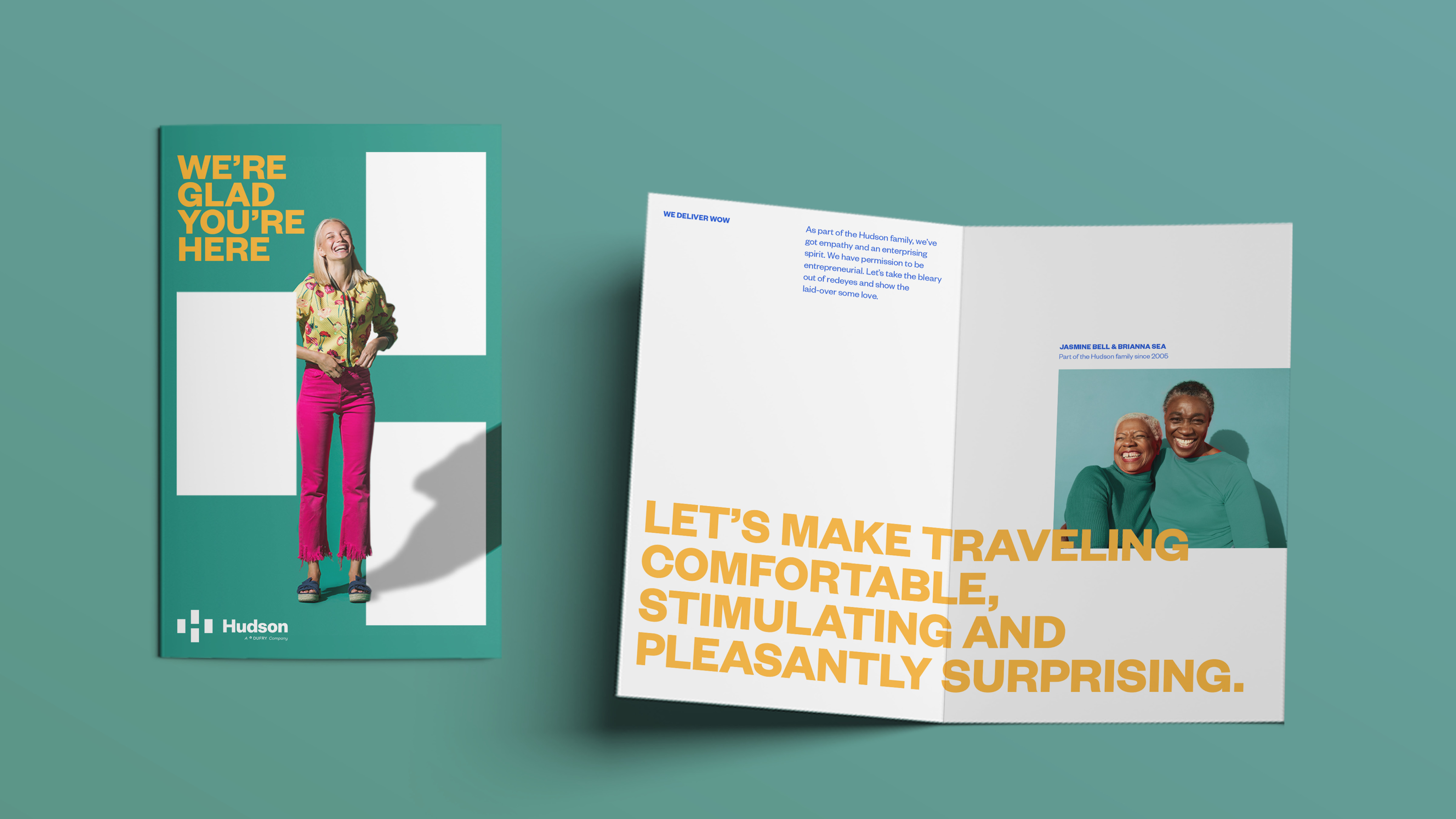
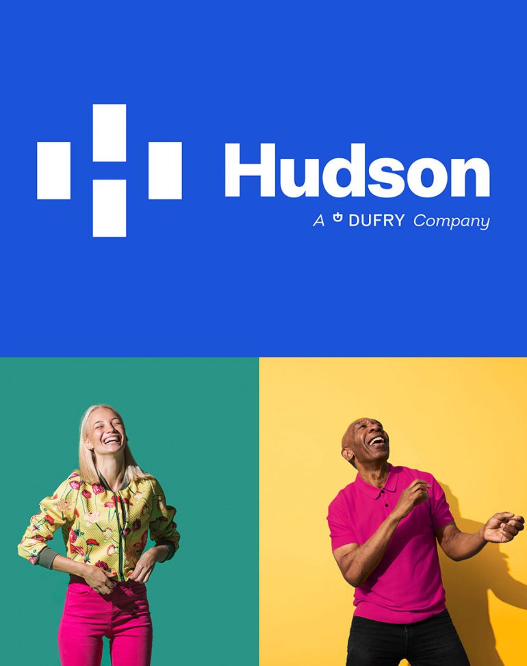
The new logo captures how its myriad strengths combine to make Hudson a whole far greater than the sum of its parts—and helps highlight Hudson’s distinctive assets: its people, brands, locations, and, most importantly, its authentic understanding of travelers and their experience. The visual identity works as a fluid, modular asset, ideal for showcasing the brands that Hudson shares with travelers—the delightful surprises they have in store—in new and unexpected ways. The color palette helps Hudson stand out from its competitors. The team chose vastly more diverse and colorful expressions for Hudson’s brand communications: just enough options to keep things feeling fresh, yet coherent. Using the logo as a supergraphic helps support the idea of how integral Hudson is to the traveler’s experience, by appearing as a window framing the most memorable moments in travelers’ journeys, and their end destinations. The new brand signals Hudson’s immense expertise, illuminates its vast portfolio, celebrates team members and displays its understanding of travelers.
“While Hudson’s original logo reflected the times in which it was created, and has served the company well, it’s time to introduce travelers to Hudson’s new look, feel and identity that reinforces our foundation and showcases where our brand is going. Our new identity is sophisticated and confident, with a welcoming visual representation of the company’s DNA that perfectly spotlights our people, brands, locations and, most importantly, our customers, and strengthens Hudson’s authentic connection to travelers.”
—Hope Remoundos, EVP & Chief Marketing Officer, Hudson

Brand Communication
What inspired the new brand voice?
Billy Kingsland + Heather DiLeo: We helped Hudson seize the opportunity its IPO provided to own the travel experience category it was instrumental in defining.
Hudson was ready to tell the story of its remarkable evolution—from a single newsstand in LaGuardia Airport in 1987 to a landmark offering specialty retail, books, travel convenience, and food and beverage in more than 1,000 locations in North America. As we immersed ourselves in Hudson’s world, we discovered that its ability to make travelers feel welcome was every bit as important as its capabilities and reach.
We developed Hudson’s platform to capture its distinctive role, as—as one customer tweeted—the Traveler’s Best Friend, while acknowledging its ability to make airport terminals as memorable as they are profitable, and vendor-partner brand locations feel like destinations.
We created a voice that reflects Hudson’s ability to solve problems, indulge appetites and stimulate imaginations. Hudson’s new brand voice makes commutes more comfortable and helps even those of us passing through feel we’ve got friends in town.


