Today, April 18th, your taxes are due. Why the 18th? Well, the federal government was nice enough to give you the weekend to find each and everyone of those receipts and get all your numbers in order for the taxman.
And, in honor of the one other certainty in life, Siegel+Gale’s Design and Brand Communication teams took on the challenge of redesigning and reimagining the look and feel of the IRS (as proposed here by Bloomberg) in order to make the IRS logo and identity simpler, more fun, and more accessible to tax payers like us. Here’s what our team came up with:
Introducing a new way to pay
by Jennifer Eggers, group director, Brand Communication
The idea: Lay the groundwork for a more meaningful relationship with the IRS and enhance individuals’ sense of citizenship by connecting taxpaying to the impact it creates.
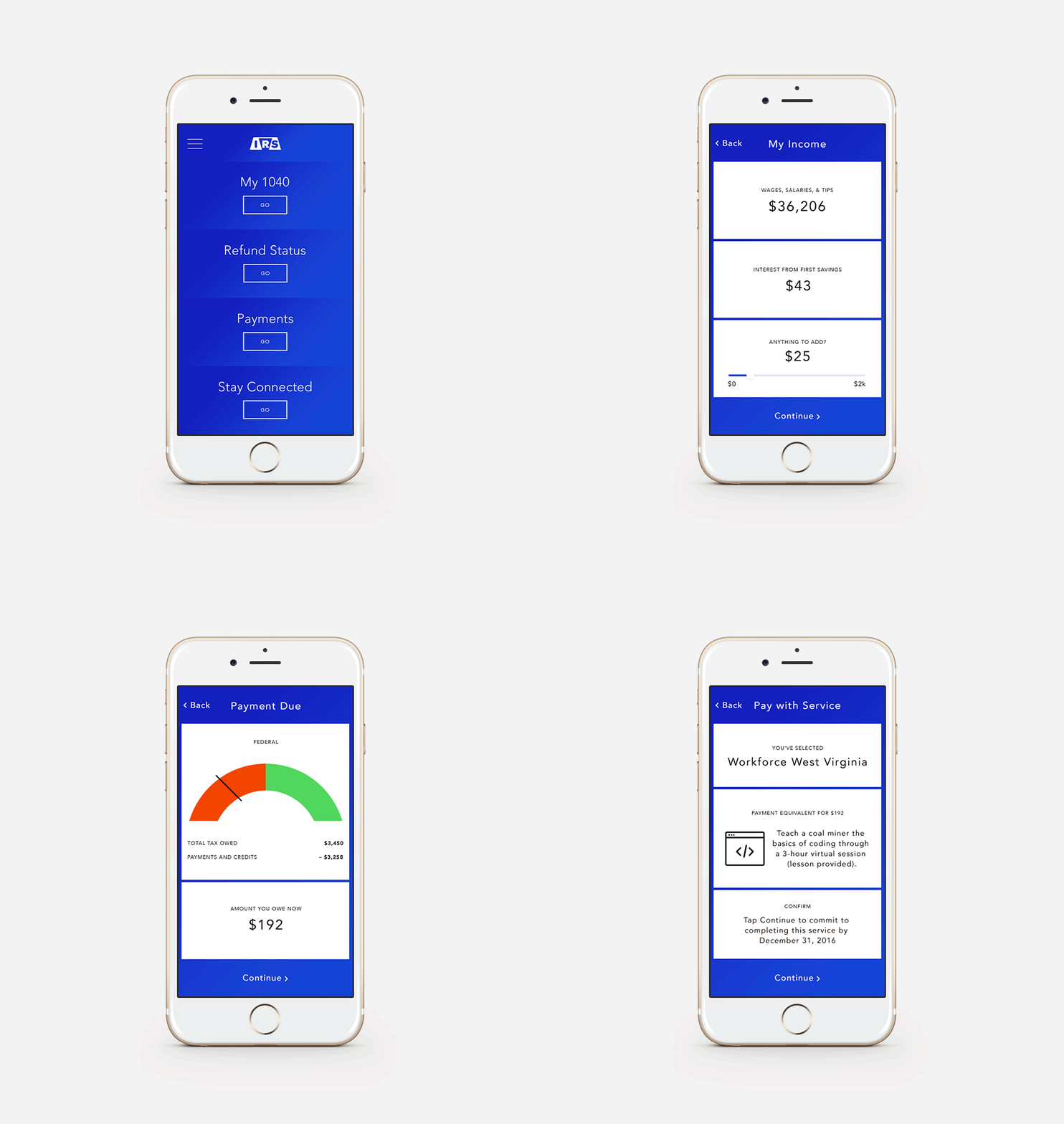
How it works: All taxpayers have the option to pay amounts owed through direct service rather than writing a check. The IRS provides a selection of government-sponsored charitable organizations based on the taxpayer’s location, occupation and age. A “Service Conversion Calculator” then gauges the time and effort a taxpayer would have to dedicate to pay their taxes in kind.
Why it’s powerful: Millennials now make up a majority of the workforce. Research shows they are motivated by making a difference in the world, and crave experiences over possessions. While a portion of the taxes they pay will ultimately funnel back to the community, paying through direct service is a more immediate way to see their taxes in action and connect to what it really means to be a taxpayer contributing to the resources of our country. Even with less dollars coming in, the U.S. government benefits: this direct service creates a virtuous cycle that grows skills within the community, and empowers the next wave of taxpayers.
Introducing the 1040EZR form
by Maria Boos, group director, Simplification; designed by Sierra Siemer, senior digital designer
The idea: The IRS offers a true e-file option that is optimized for mobile, tablet and desktop.
How it works: The e-file system pulls taxpayers’ data directly from their Forms W-2 and 1099, showing the calculations in a logical sequence, explaining the amount to be refunded or due and offering options for how to pay.
Why it’s powerful: Millennials (and other segments, for that matter) don’t think about their financial and administrative tasks (like paying taxes) and “digital” as separate activities. They simply expect to transact, pay, inquire, shop, learn, etc. whenever and wherever they choose, on the device they prefer. By rising to the expected level of functionality—and surprising taxpayers with true simplicity—the IRS can increase timely filing, engender understanding of basic tax concepts and encourage the perception that “we’re all in this together.”
A new IRS logo, look and feel for the taxman
by Amanda Voss, creative director, New York
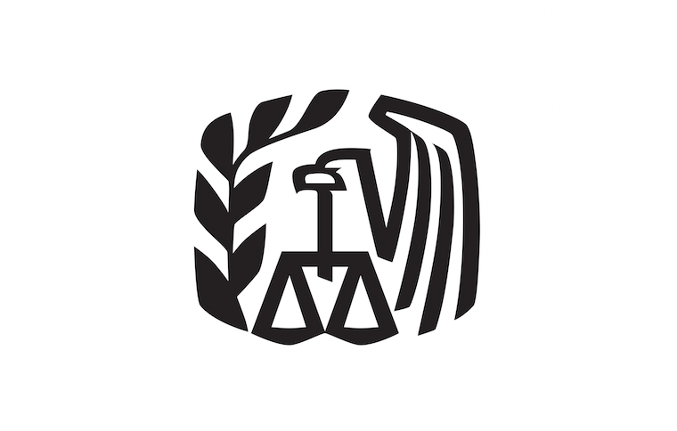
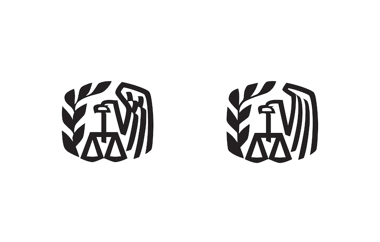
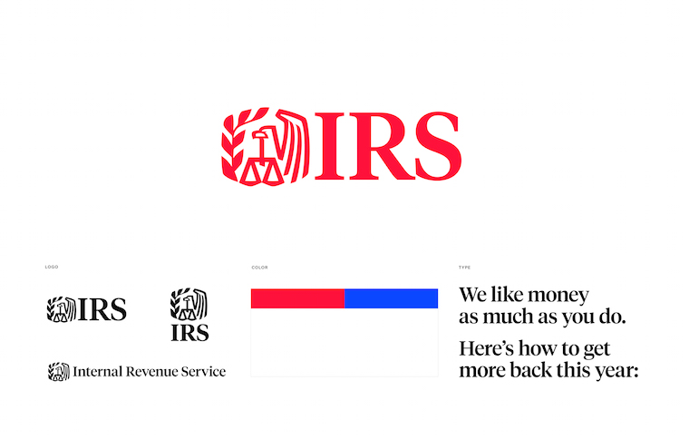
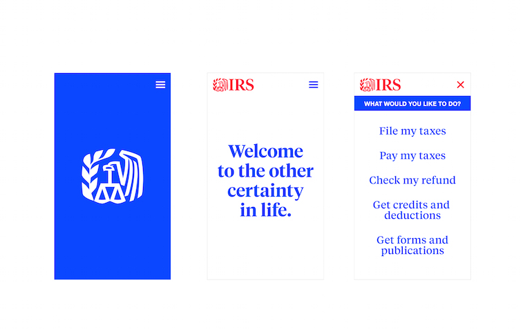
The IRS symbol or the IRS Eagle itself represents the United States. The scales of justice instill the idea that the Service’s operations will be conducted in a fair and honest way. The decorative olive branch fills out the left side of the symbol and represents peace and conciliation. The scales symbolize justice and fairness. There is equity in the integrity of the IRS Eagle and while it might be perceived as retro I find the graphic style to be timeless and feel the mark simply is in need of a refresh. I think a cleaned-up symbol paired with Tiempos which has Times New roman influences and a radical blue give the logo a new life.
Branding isn’t just about how you look but also how you speak and behave. A responsive, simplified, user-friendly website and approachable tone of voice would set the IRS up as a tech savvy financial partner and give the institution the approachability we need this branch of the government to possess.
Balance and fairness
by Mike Scott, design director, London
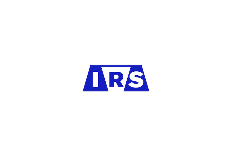
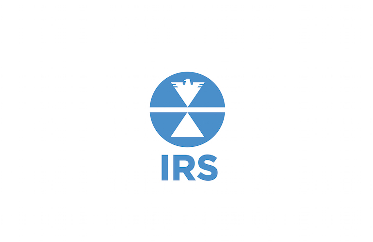
Integrating the three letters in a simple, unique rendition of a set of scales, which presents notions of balance, equality, and fairness. The style of typography in this IRS logo design is chosen to sit comfortably amongst the strong angular forms without being overpowered, with the letters’ straight lines creating rhythm against those of the scales. In a rich blue the mark is lent a serious authority – and perhaps an American-ness – that off-sets the playful symbolism, as well as calling back to the blue of the current identity.”
Transparent, open, balanced
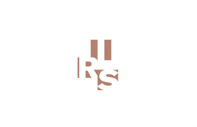
The three letters are suggested in the negative space, each in a slightly different way (the I plainly centered, the R relying on the angle from the S’s box to complete it) which offers pace and tension. The copper color suggests currency but also gives a soft neutrality, and a non-harsh, unexpected level of contrast.
Balance, equality, boldly American
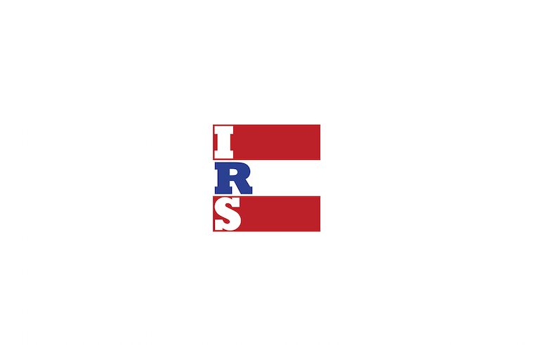
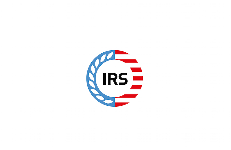
The mark’s type style, form and color recall multiple aspects of American visual culture. The stripes are an equals sign, and bring to mind an abridged form of the US flag. The overall effect is confidently poster-like, yet still strong and officious. An identity so boldly American can be used to hold brand stories along the lines of “doing your bit,” “all in it together” and similar themes that talk of the fundamental purpose of the IRS.
Simplicity marks the spot
by Olivia Lee, junior designer, New York
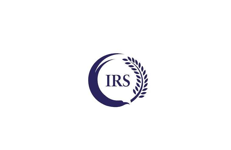
This is a modern and simple interpretation of the existing IRS logo that is more friendly and approachable. The right and left American motifs represent peace and justice in perfect balance, mirroring the values of the country and the organization.
An eagle and an olive branch form a circular movement together while coexisting harmoniously. It conveys the idea of peace and balance.
Simplified marks, consisting of a scale and an eagle, represent justice and the United States and are visually balanced. It conveys the idea of equality within the organization and the country.
Thanks to all our designers and practitioners who participated, and don’t forget to get your taxes filed today!


