In SMPL Q+A, we interview Siegel+Gale practitioners on all things relevant to branding, design and simplicity. Here, we speak with Rana Brightman, Group Director of Strategy, Ben Osborne, Head of Insights + Analytics EMEA, Deva Corriveau, Design Director and Kate Floyd, Senior Strategist, Brand Communications about our rebranding work for Superscript, a trusted insurance provider for small businesses across all sectors.
Why did Superscript engage Siegel+Gale?
Rana Brightman: Founded in 2015, Digital Risks set out with a bold ambition—to bring the age-old model of small business insurance into the modern era. From the founders’ personal experience, this model was proving unfit for the needs of businesses today. Part online platform, part specialist insurance broker, Digital Risks understood the needs of digital businesses and professions evolving in the digital age. The brand offered customers a simple, flexible and tailored experience.
In recent years, the success of their offer meant the company’s scope and capability have grown beyond the technology sector. Entering a new phase of growth, Digital Risks recognized the need to update its brand, from name to visual identity, to support the rapid scaling among both divisions of the company—online insurance aimed at all SMEs and advised insurance specializing in emerging markets.
What was unique about this engagement?
RB: The original brief was to consider two brands. The first, a repositioning of Digital Risks, and the second a new brand targeting a more general SME customer, such as tradesmen and less digitally-focused professions. However, when we got under the skin of the company and its values, the concept of championing small businesses regardless of profession compelled us to challenge the brief. This wasn’t about creating a new brand but elevating what they had already established and finding a compelling purpose that would resonate across all types of businesses.
What role did research play in this partnership?
Ben Osborne: To find the connective tissue that ran through both the existing brand and the needs of all future audiences, we conducted in-depth interviews with a representation of small business owners and start-up founders. We purposefully targeted as broad a profile as possible—targeting the over-insured and under-insured, both digital and physical risks, the traditional and the cutting edge, micro-businesses and larger enterprises. Our research validated our view that one brand could fulfill the needs of all audiences; it revealed the compelling, emotional red thread that could unite them.
Can you explain the new brand strategy?
RB: Building on the insights from our discovery work, we developed a purpose for Superscript that was about setting higher standards for business insurance, embracing the inherent risk that exists when you start a business and the bravery and commitment required to embrace that risk. This then informed the idea of positioning risk as an enabler, with Superscript as the insurance partner that elevates its customers and helps businesses find the freedom they need to thrive, in whatever profession or industry they’re in. We developed four distinct principles, which we refer to as the Un-ness of the brand, defining the values and personality of Superscript—Unafraid, Unassuming, Unexpected and Unstoppable.
How did you land on the brand voice?
Kate Floyd: The brand principles became the inspiration for Superscript’s voice. We explored how each would translate in conversations, touchpoints and communications across the brand experience, and provided a set of tonal guardrails and tips for modulation in specific scenarios. Working together, our principles and tone of voice then shaped the verbal identity with distinct themes and key messages for Superscript’s SME and Enterprise customers.
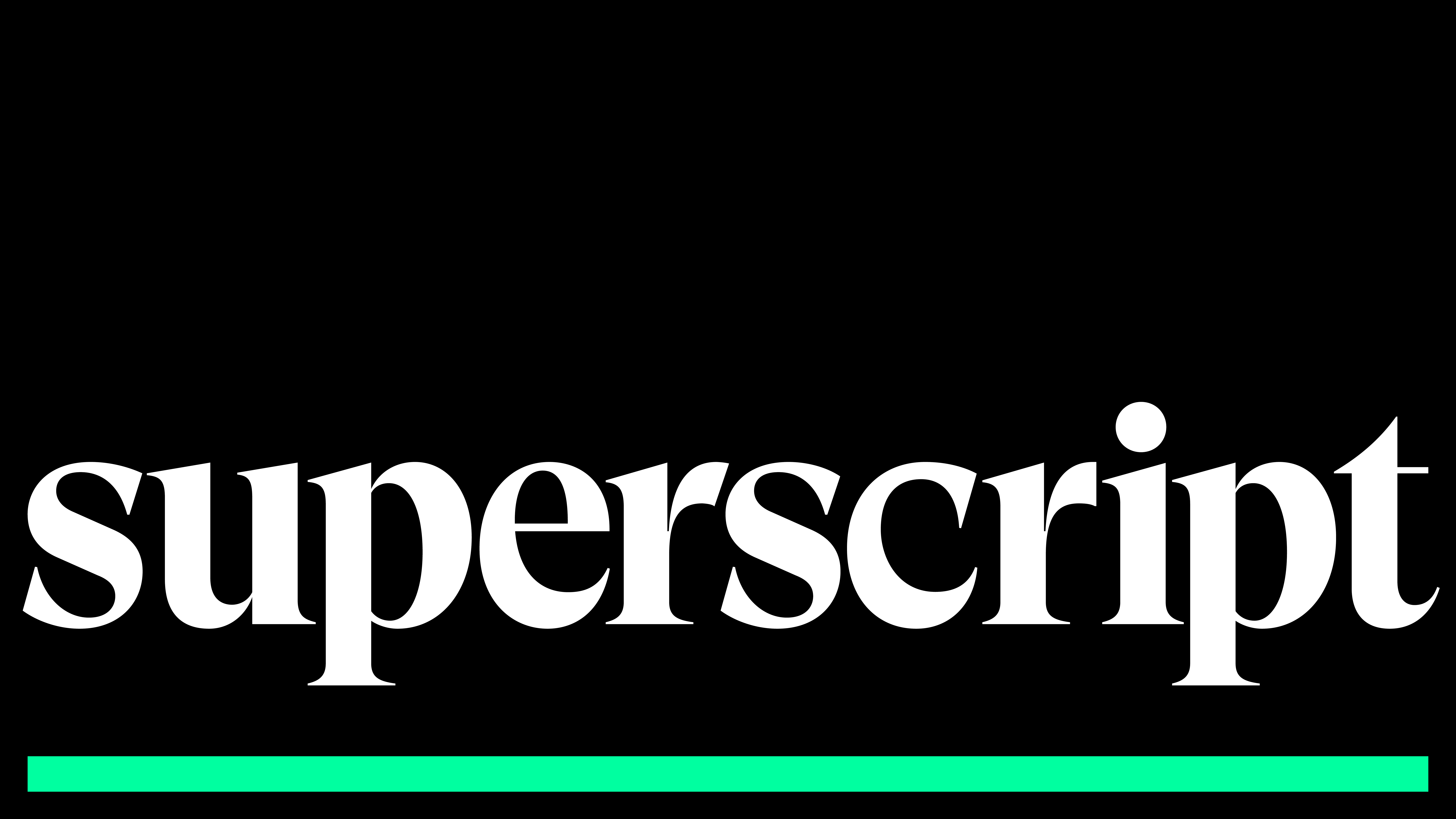
Why the name Superscript?
RB: The name Superscript was adopted from typesetting terminology. By definition, it means a character set slightly above the normal line of type to denote and acknowledge its importance. Superscript is setting higher standards for business insurance, recognizing the importance of what their customers do, and acknowledging the ultimate benefit of insurance for businesses—freedom to do what they do best.
What process was used to define the visual identity?
Deva Corriveau: Before starting work on the creative, we identified that it was important for the visual identity to help Superscript display its unique offering and differentiate itself from other insurance providers. For this reason, we undertook an in-depth audit of the competitive set. We conducted workshops with the client to define the category tropes and trends that we would look to avoid when developing the identity.

What was the inspiration behind the visual identity?
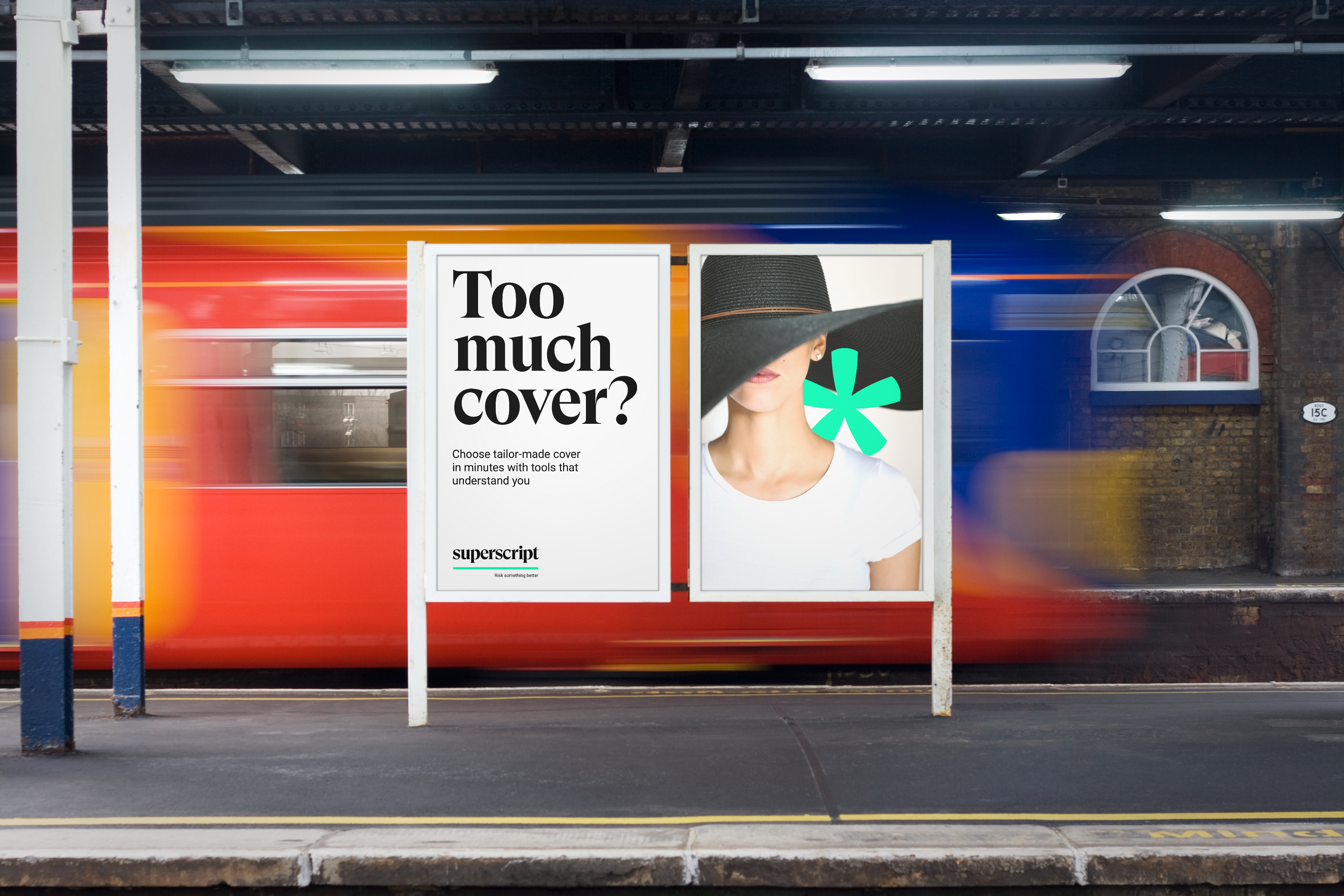
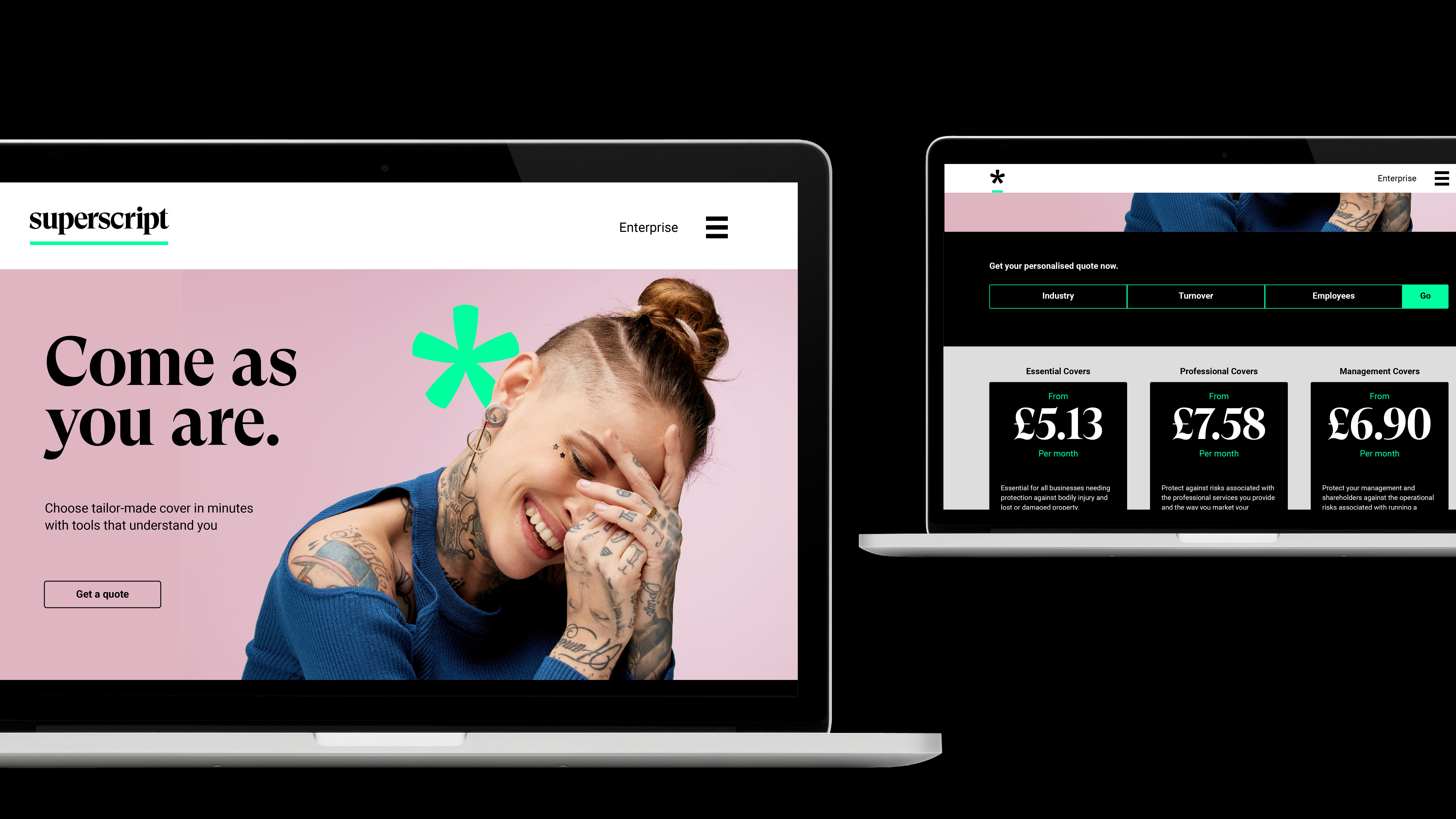
DC: The graphic system builds on the brand’s new name. The link to typography within the name gave us a fantastic springboard to explore beautiful lettering and glyphs as a vital part of the visual identity.
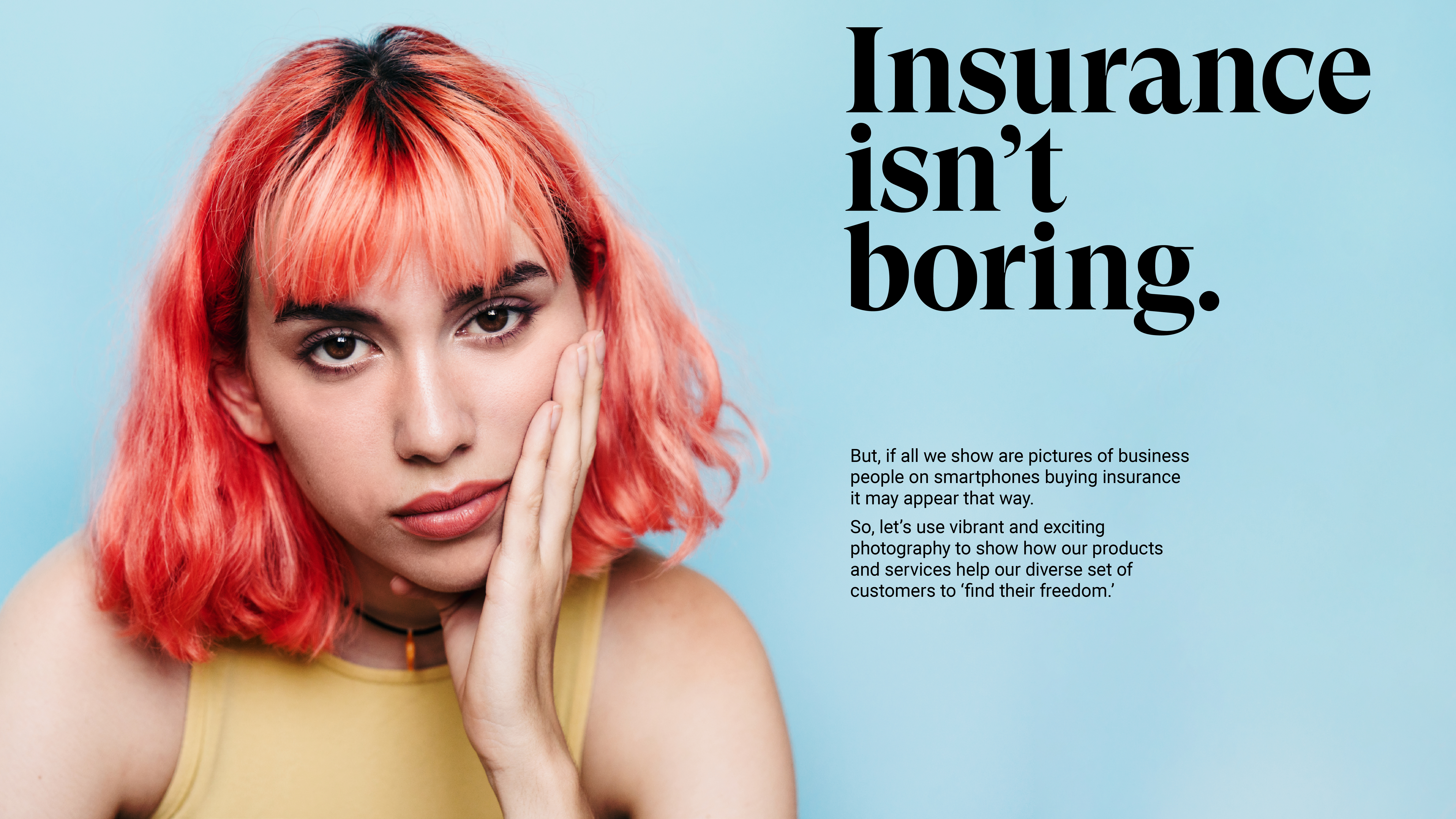
Another key aspect of the identity was how we show Superscript’s customers, partners and people. We wanted to make it clear that Superscript is for everyone and to flip the perception of business insurance from stuffy and corporate to empowering and inspirational. We did this by showing the people Superscript work within a range of vibrant, candid portraits.
Our Superscript team includes Ben Osborne, Head of Insights; Rana Brightman, Group Director, Strategy; Deva Corriveau, Design Director, James Snook, Senior Designer, Kate Floyd, Senior Strategist Brand Communications; and Stephanie Down, Senior Project Manager.