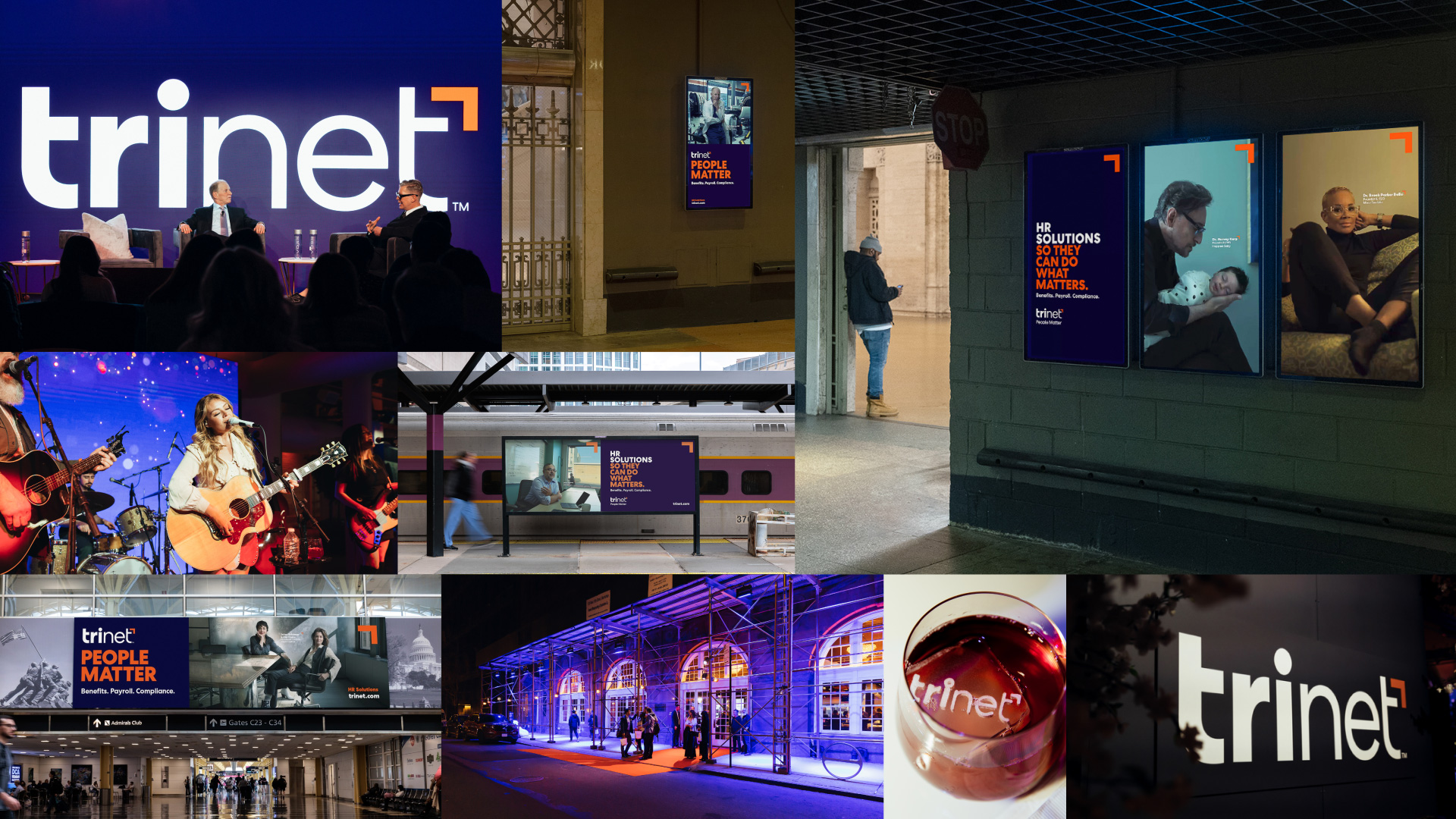
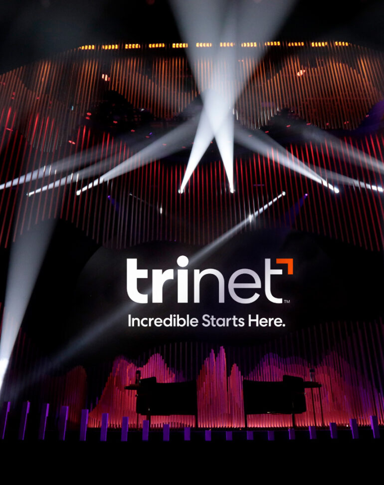
In SMPL Q+A, we interview our practitioners on all things relevant to branding, design and simplicity. Here, we speak with our experts about our work with TriNet. A leading provider of comprehensive human resources solutions for small and medium-size businesses, Trinet unveiled its new look and feel in April 2023. The identity underscores the brand’s commitment to the growth and innovation of small and medium-size businesses and the people behind them. Learn more about the new brand identity here.
What made this engagement so unique?
Matthias Mencke, Group Creative Director: TriNet, a professional employee organization that provides small and medium-size businesses with full-service HR solutions tailored by industry, originally came to us to evolve their brand identity to reflect how the organization had grown, in particular given the acquisition of Zenefits, which allows TriNet to expand its offering in the field of people management. On the surface, it’s a pretty typical assignment.
But as we were immersing ourselves in the project, we quickly learned that TriNet is passionate about advocating for small and medium-size businesses. That organizational purpose of helping businesses thrive by providing effective HR Solutions was highlighted when the Dobbs decision shook the nation. That Supreme Court ruling not only profoundly impacts people’s lives but also affects businesses as they are trying to navigate regulations that vary from state to state. In light of this decision, TriNet moved very quickly to offer a service allowing businesses to provide adequate employee benefits. This evident commitment to SMBs motivated us as we developed the brand identity.
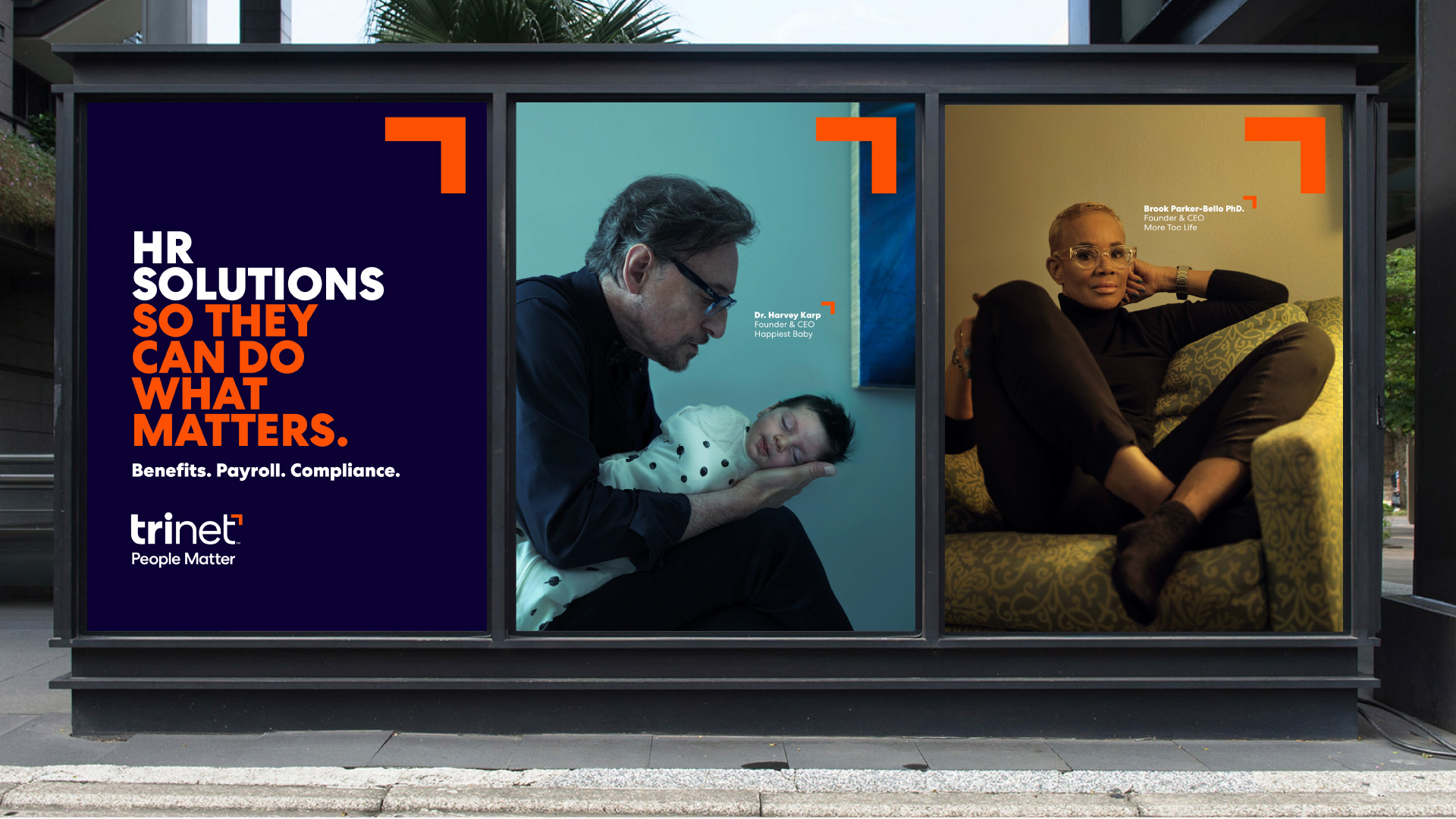
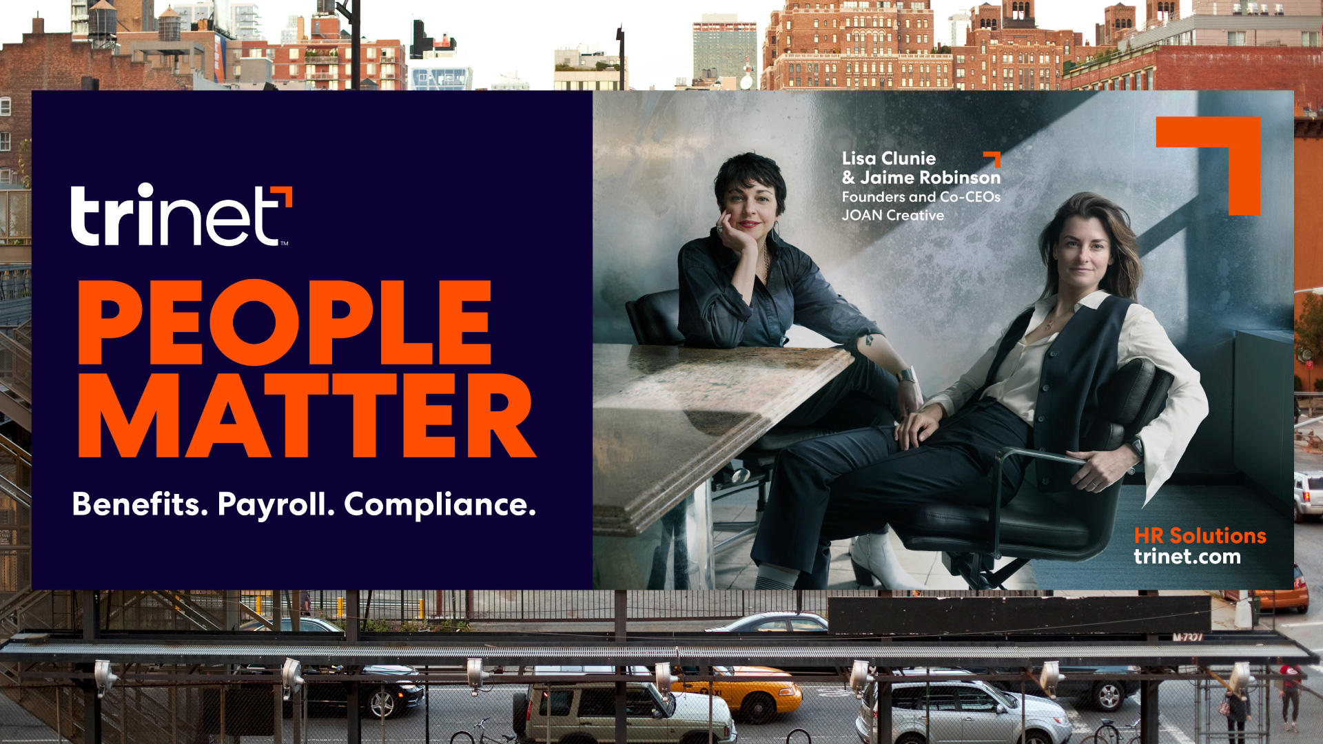
From a creative side, we had to consider how our visual identity could incorporate custom photography by Annie Leibovitz. The visual design system had to strike the right balance between building recognition for an evolved logo and visual language while celebrating the photography by Annie Leibovitz.
Brand Communication:
How does the new verbal identity help TriNet communicate its brand story?
Allison Gregory, Director, Brand Communication: When TriNet came to us, they knew their story was about more than HR solutions. The brand had long been a trusted advisor to small and medium-sized businesses, helping them mitigate risks and lifting them to their full potential. With TriNet’s recent acquisition of Zenefits, we were faced with the challenge of translating their personality to the brand’s verbal expression—what would it sound like for them to be a trusted advisor to their audiences today?
We started with a clear messaging strategy that helped TriNet tell a new story centered around giving customers and their partners the time, solutions and certainty they need to grow their businesses and better their employee experiences. We also zeroed in on a brand voice that resonates meaningfully with their specific audiences. With a helpful, personable, and optimistic tone, we brought to life the benefits of working with TriNet: deep expertise, honest encouragement and a refreshingly real take on the challenges of running a business.
Design:
What was the concept behind the new visual identity? Any inspiration you would like to call out?
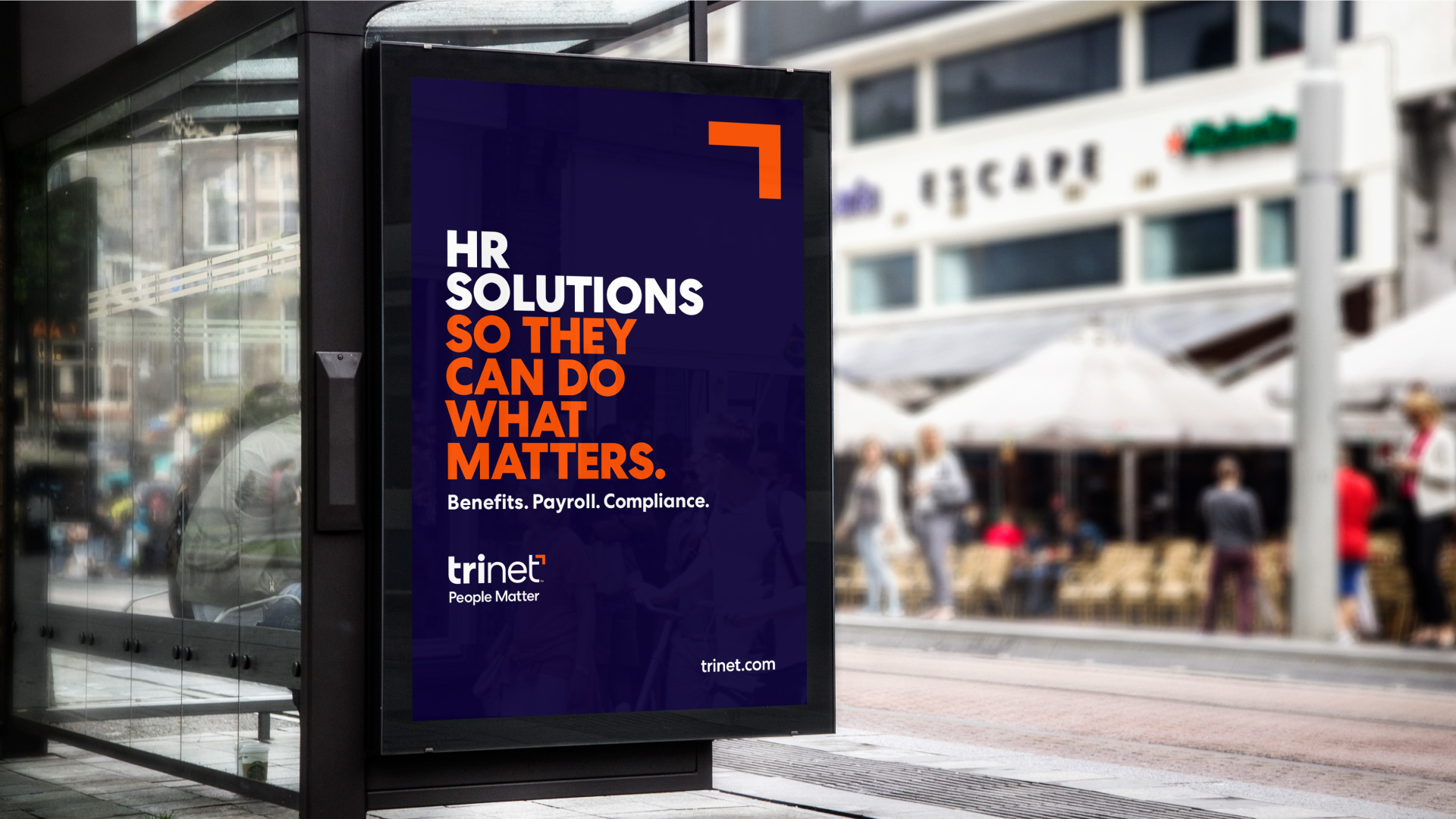
Matthias Mencke, Group Creative Director: While the visual identity is an evolution of their logo and design system, we were inspired by the tension between strength and humanity, between tackling the complexity of HR and making it simple for customers to choose. Besides addressing some functional aspects, such as greater utility in the digital realm, we developed a logo, primary color and typographic layout with the visual strength to position TriNet as a steadfast partner to its customers. We balanced that visual impact with humanity expressed through warm supplementary colors and an approachable logotype—and by giving Annie Leibovitz’s photography centerstage. Lastly, we ensured our overall system is based on a concise and clear design language that can communicate how TriNet helps customers navigate the space of HR solutions.
How was the new logo developed?
Matthias Mencke, Group Creative Director: The creation of the logo was a collaborative process with the client team. We explored various options, from close in to far out, to determine the appropriate degree of change. We crafted some terrific ideas that represented a wholesale change. Still, we quickly realized that it would be too disruptive. Ultimately, we landed on a logo that represents a modernization of the old logo while infusing greater visual strength and clarity.
![]()
How does the new identity underscore TriNet’s commitment to growth and innovation?
Matthias Mencke, Group Creative Director: Through its simplicity and visual stature, the new identity signals that TriNet has evolved and continues to grow. Additionally, the new identity is designed to work effectively in the digital realm and, therefore, support TriNet’s expansion in offering HR as SaaS and allowing the brand to remain relevant as the administration and access to HR continues to migrate toward virtualization.
